
Rooms and Rates Display
Rooms and Rates Display
Compare and select your perfect stay
Compare and select your perfect stay

Overview
Overview
In the summer of 2023, I joined Expedia Group’s Smart Shopping team as a UX Design intern. I focused on enhancing Room and Rate comparison and discoverability on the product details page.
I spearheaded a comparative analysis for ongoing utilisation across all design teams, crafted and championed a strategic vision for room and rates features, and orchestrated a successful launch test resulting in a $1.1 million increase with my design.
My Role
UX Design Intern - Interaction Design, Rapid Prototyping, Visual Design, User Flows
Team - Smart Shopping
Jamie Thompson, Andrew Owen, Evano Pescatore, Xinye Li, Sam Reif,
Matteo B, Tina Safaie
Skills
User Experience Design, User Research & Testing, Wireframing, Interactive Prototyping, Stakeholder Management
Results
$1.1 Million in Revenue increase, 2x Features, Shipped
Timeline
3 Months - June - September 2023
My Role
UX Design Intern - Interaction Design, Rapid Prototyping, Visual Design, User Flows
Team - Smart Shopping
Jamie Thompson, Andrew Owen, Evano Pescatore, Xinye Li, Sam Reif, Matteo B, Tina Safaie
Skills
User Experience Design, User Research & Testing, Wireframing, Interactive Prototyping, Stakeholder Management
Results
$1.1 Million in Revenue increase, 2x Features, Shipped
Timeline
3 Months - June - September 2023
Introduction
Introduction
Travel is a significant global industry, involving billions and employing a substantial workforce. It's not just about movement but a network of experiences linking cultures and economies.
Booking accommodations is crucial in travel, offering travelers a secure and planned stay, and mitigating the complexities of their journey. Although navigating through options for location, budget, and amenities can be challenging, securing a place to stay is a vital step in ensuring a smooth and enjoyable travel experience.
Following the second quarter of 2023, the Smart Shopping research team uncovered that our travellers were looking for a better way to compare rooms and rates when booking holidays using Expedia.
A core focus of this project was collaboration with team members of different disciplines to establish an iterative design process founded on the back of peer reviewed feedback.

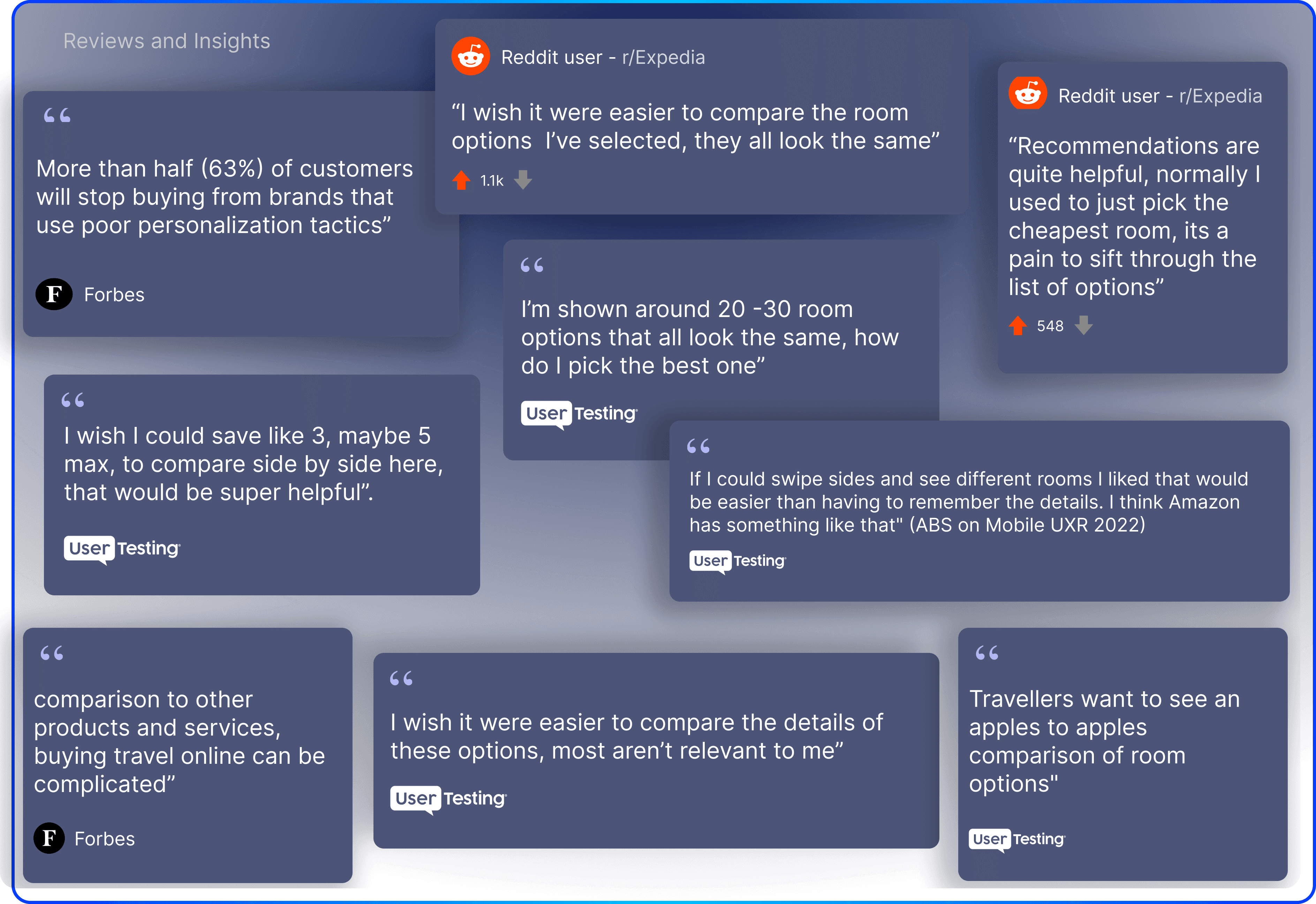
What our travellers are saying...
What our travellers are saying...
Demand for Comparison and Personalisation withing booking stays.
Demand for Comparison and Personalisation withing booking stays.
As seen in the diagram below. We saw that our travellers were looking for a more personalised experience with the ability to compare their options effectively.
We saw that our travellers were looking for a more personalised experience with the ability to compare their options effectively.
Research and Insights
Research and Insights
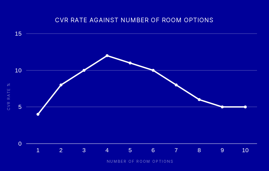
Data from out research team showed that the peak CVR Rate was between 3 - 6 room options.
The data presented us with an opportunity to showcase the optimal number of room options on the product details page, ensuring a user experience that is both comprehensive and user-friendly. We achieved this by incorporating a method to consistently display 3-6 room options within the initial viewport.
Data from our research team showed that the peak CVR Rate was between 3 - 6 room options.
The data presented us with an opportunity to showcase the optimal number of room options on the product details page, ensuring a user experience that is both comprehensive and user-friendly. We achieved this by incorporating a method to consistently display 3-6 room options within the initial viewport.
02.
Define
Problem Statement
Initial Solution
Comparative Analyses
02.
Define
Problem Statement
Initial Solution
Comparative Analyses
01.
Empathise
Context Analyses
User Research
Pain Points
Problem Definition
Booking rooms can be overwhelming and confusing
Users typically choose the cheapest option when selecting rooms, we believed this was due to the overwhelming nature of the rooms and rates display. However by doing this, many of our travellers often miss out on valuable amenities and offerings, potentially leading them to book a room that may not be ideal for them.
Problem Statement
“Travellers are finding it difficult to browse and compare rooms and find the amount of room options overwhelming”
Our goal was to help determine what design and concepts helps travellers better understand and compare qualities of a room effectively. It was also to enhance discoverability and the personalisation of the display of rooms and rates on the product details page.
This project came with a few factors to consider. Firstly the short time frame, scalability of the design, multi-platform adaptation and aligning to Expedia Group’s design system.

10 Week deadline. This workstream is geared towards fast paced design improvements

Scalability. Ensuring concepts can be applied to other Expedia Group LOBs such as flights and cruises.

Platform compatibility. Adapting the concept to Expedia’s Desktop, App and mWeb platforms

Design system compatibility. Aligning with the EGDS (Expedia Group Design System)
How might we...
so we know that our travelers are in need of better personalised and a more efficient comparison experience.
So we know that our travellers are in need of a personalised and more efficient comparison experience.
“How might we facilitate better comparison and personalisation within the booking process of rooms”
“How might we facilitate better comparison and personalisation within the booking process of rooms”
The aim is to explore solutions to enable better apples to apples comparison among room and rate options as well as improve personalisation to help our travelers find the perfect room for their stay.
The aim is to explore solutions to enable better apples to apples comparison among room and rate options as well as improve personalisation to help our travelers find the perfect room for their stay.
The Initial Solution
We delved into the previous user experience of reserving and booking a room on the product details page
We delved into the previous user experience of reserving and booking a room on the product details page
Implementing Horizontal scroll on the Product Details page on Expedia.com
Implementing Horizontal scroll on the Product Details page on Expedia.com
We decided on implementing a horizontally scrolling carousel to display rooms and rates on the product details page.
We decided on implementing a horizontally scrolling carousel to display rooms and rates on the product details page.
Hypothesis
In order to resolve these traveller problems. Our team proposed the following hypothesis
“By implementing horizontal scroll on the PDP, travellers will find it easier to navigate and explore information that is located further down the page.
This horizontal scroll feature reduces the number of rows required to display room options, resulting in a more streamlined experience. As a result, the improved navigation and presentation of information will lead to higher conversion rates from the PDP”.

Initial Test Results
Initial Results
Our team pushed out the initial test variant via a TNL(Test and Learn) test, whilst the results did not meet our optimistic expectations, we gained a lot of useful information regarding user’s behavior with the carousel in order to iterate further towards a successful product.
We found that there was a drop in impressions past the fourth card, this was most likely due to these cards, being hid within the carousel. Furthermore, there was increased engagement within the first four cards. I saw this as a potential opportunity to push for more personalisation by displaying Expedias “Recommended Rooms” within the first four cards.
Increased Engagement in Cards 1-4
Decreased Engagement in Cards 4+
Specifying the problem
Specifying the problem
From the initial problem definition I specified the problem further within the a user flow to see where we could improve and increase CVR rates from the Product Details page to the Checkout page.
The primary issues I found in the user flow was the process of choosing a room, specifically the process of viewing details about the room in order to select a room for their booking.
I aimed to address these issues in the user flow to unlock the full potential of the carousel in order to increase the conversion rate from the product details page to the checkout page.

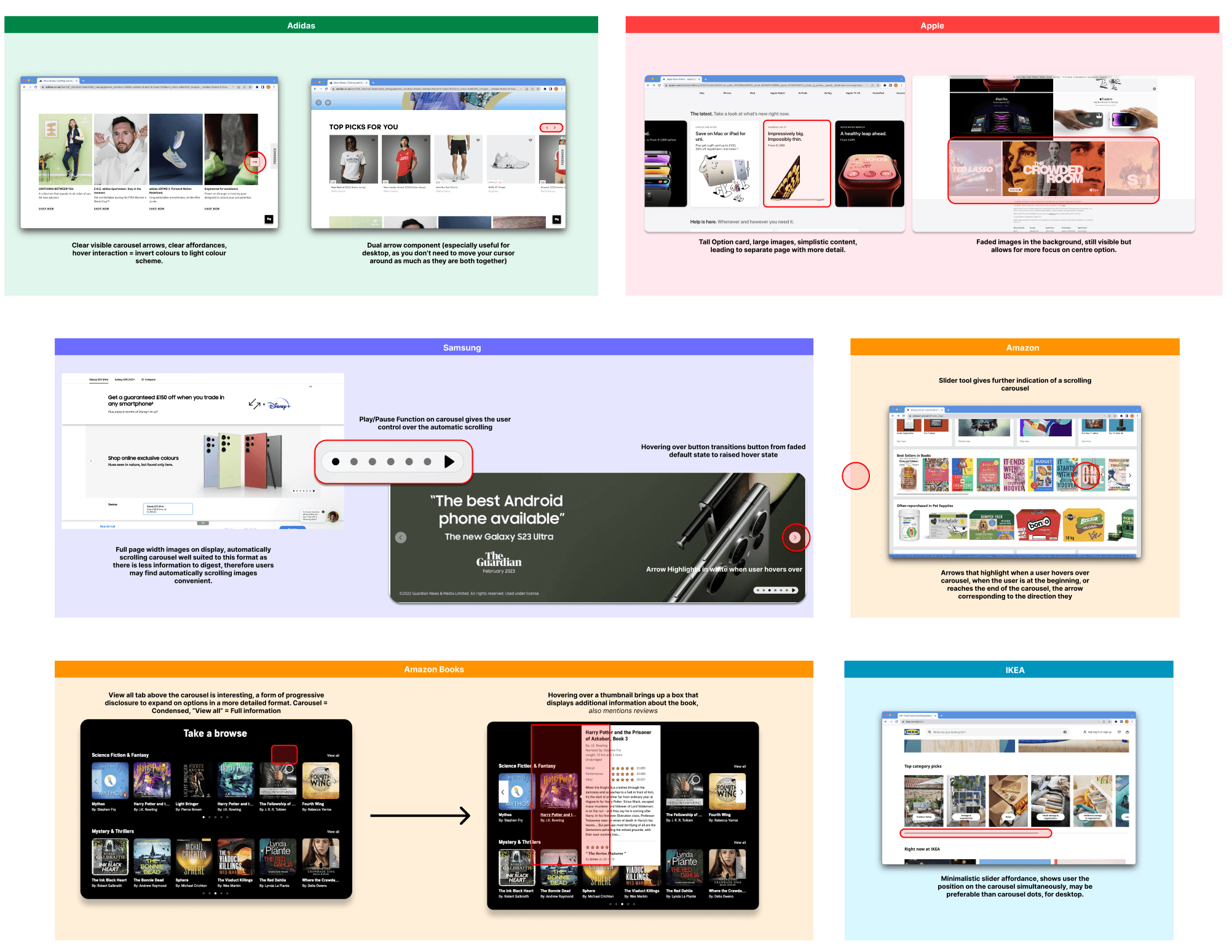
Carousel Comparative Analysis
Carousel Comparative Analysis
The insights gained from our initial test for the desktop room carousel, led to the learning that, in order to improve discoverability of the cards after room card 4 , we needed to implement improved affordances to ensure that users are aware that there are more options beyond the frame cut-off. I proceeded to conduct an initial comparative analysis to curate examples of carousels that are currently being used by industry leaders and identify potential useful features for our use case.
The insights gained from our initial test for the desktop room carousel, led to the learning that, in order to improve discoverability of the cards after room card 4 , we needed to implement improved affordances to ensure that users are aware that there are more options beyond the frame cut-off. I proceeded to conduct an initial comparative analysis to curate examples of carousels that are currently being used by industry leaders and identify potential useful features for our use case.
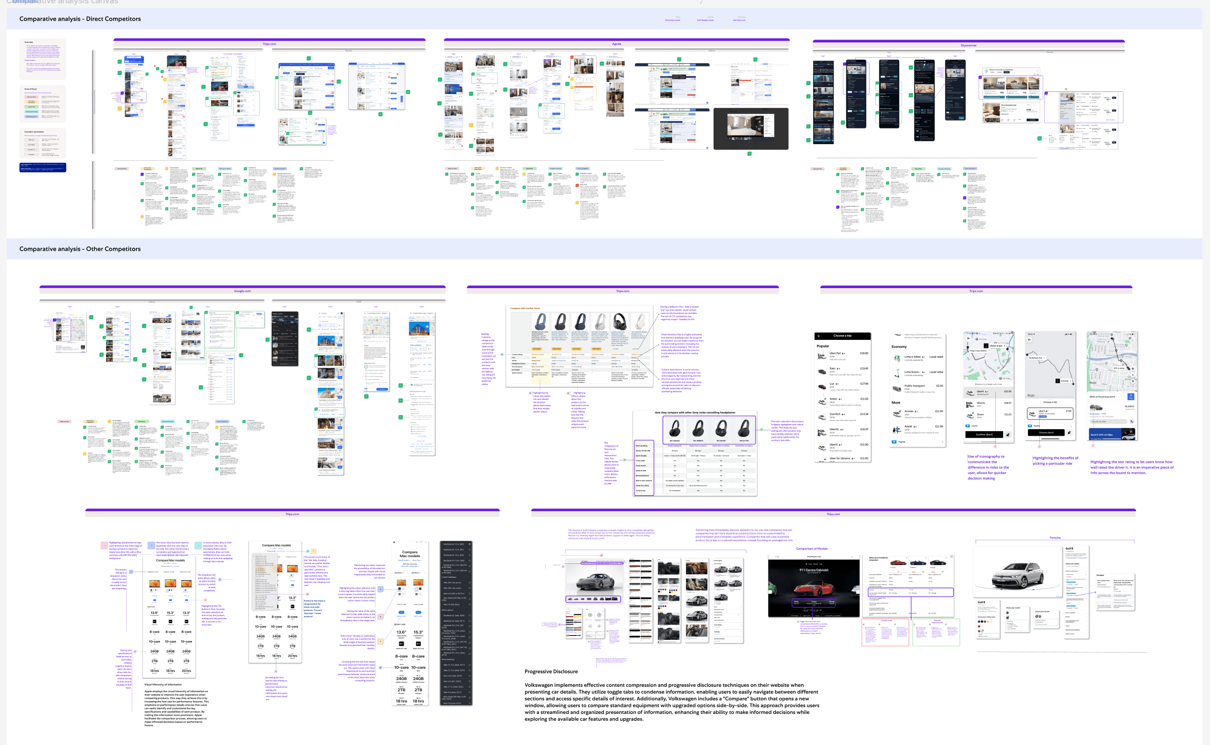
Room Compare Comparative Analysis Overview
Room Compare Comparative Analysis Overview
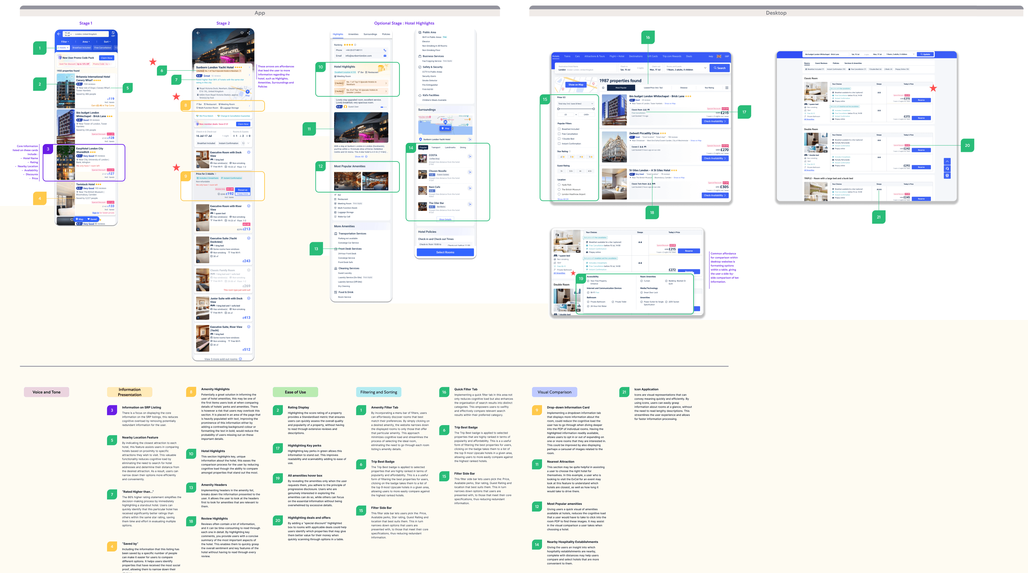
I wanted to also gauge a wider more in-depth comparative analysis to identify more ways that we can push the brief to achieve our teams wider goal, to improve comparison of rooms and rates on the product details page. I collated examples of how other companies allow users to compare products. I looked at direct competitors in the travelling space such as Agoda, Trips.com and skyscanner, to indirect competitors such as Apple, Google and Amazon. I am pleased to say that Expedia Group will be using this comparative analysis across the entire Smart Shopping team.
I wanted to also gauge a wider more in-depth comparative analysis to identify more ways that we can push the brief to achieve our teams wider goal, to improve comparison of rooms and rates on the product details page. I collated examples of how other companies allow users to compare products. I looked at direct competitors in the travelling space such as Agoda, Trips.com and skyscanner, to indirect competitors such as Apple, Google and Amazon. I am pleased to say that Expedia Group will be using this comparative analysis across the entire Smart Shopping team.
Increased Engagement in Cards 1-4
Decreased Engagement in Cards 4+
Room Compare Comparative Analysis Heuristics
Room Compare Comparative Analysis Heuristics
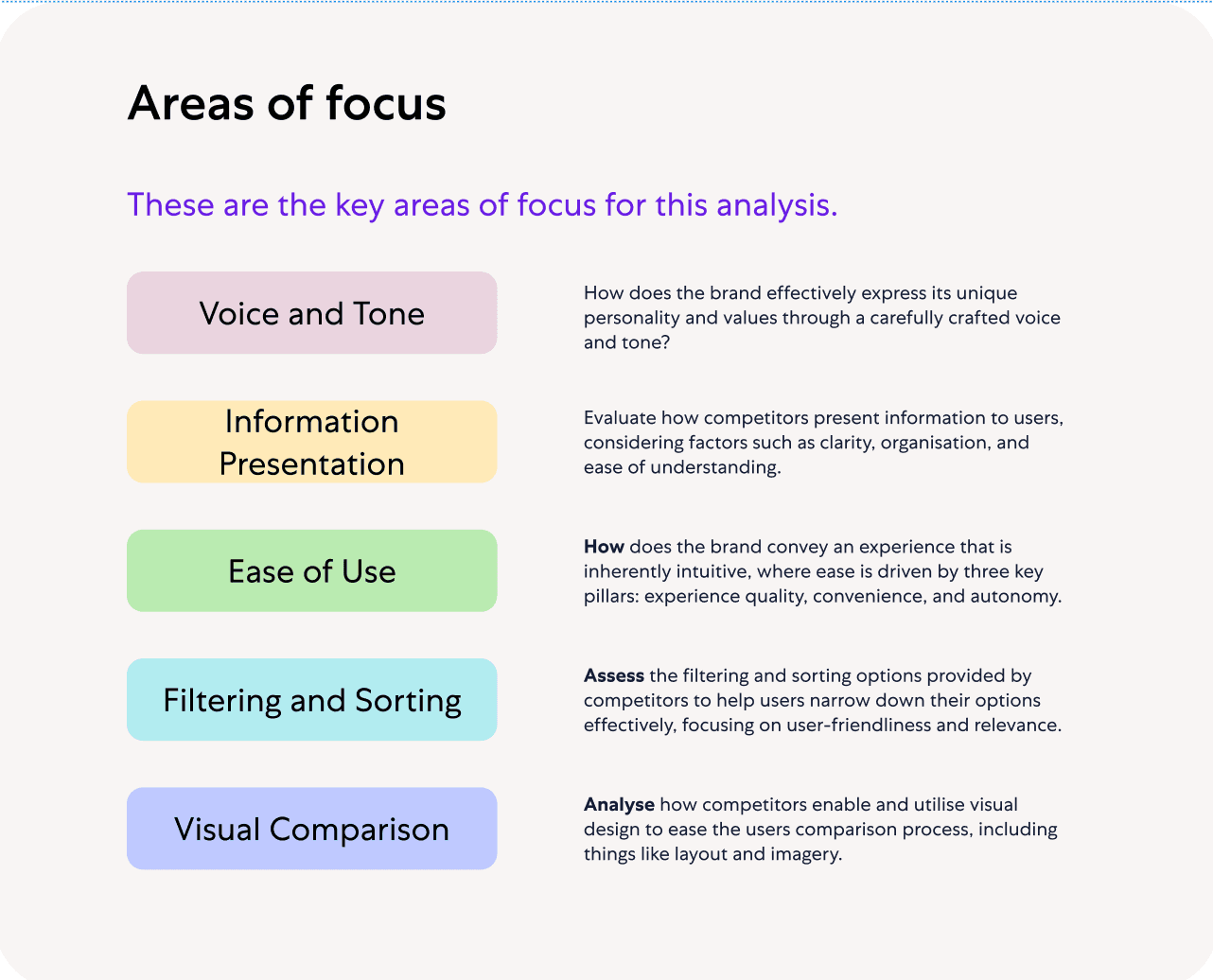
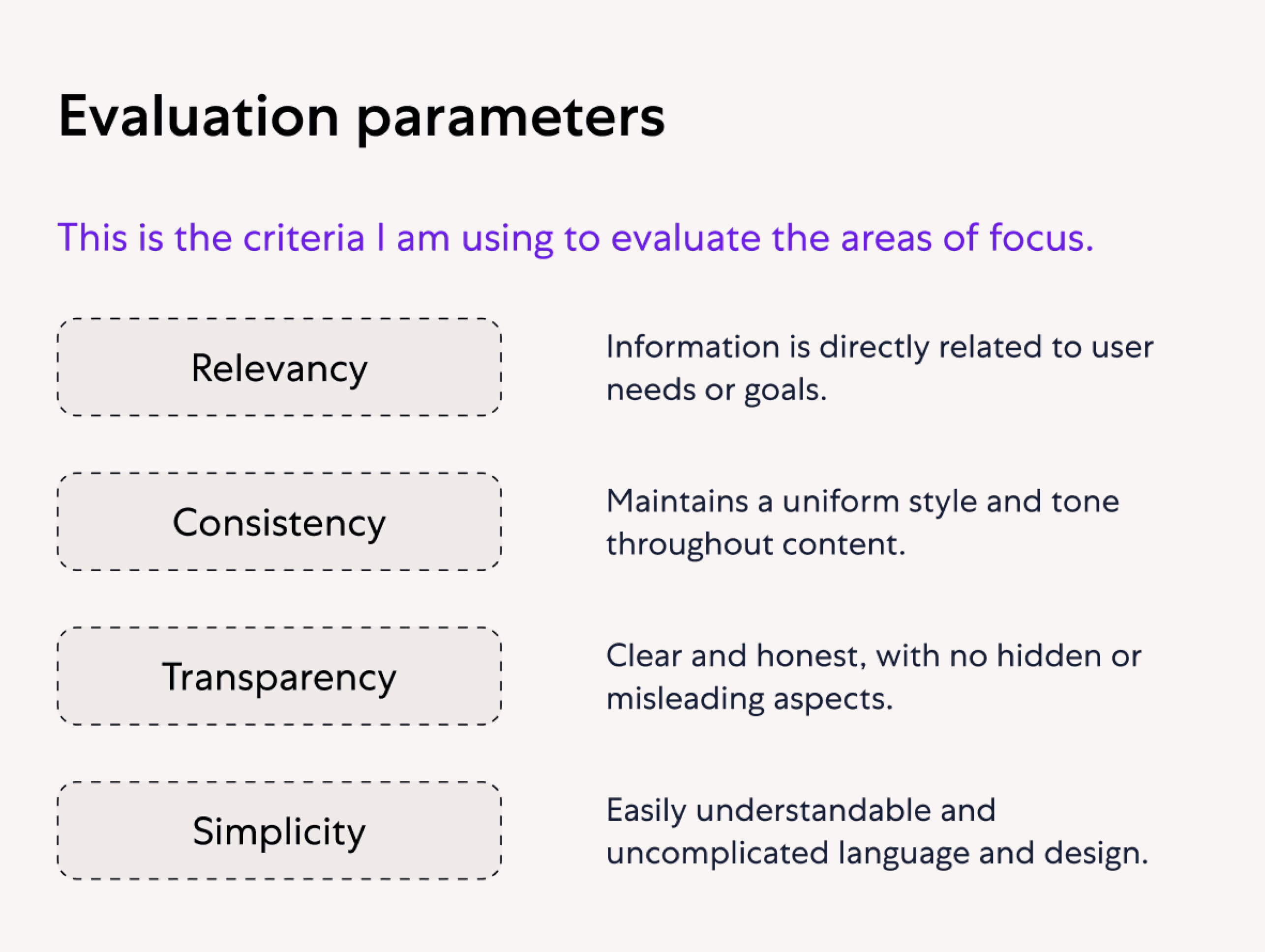
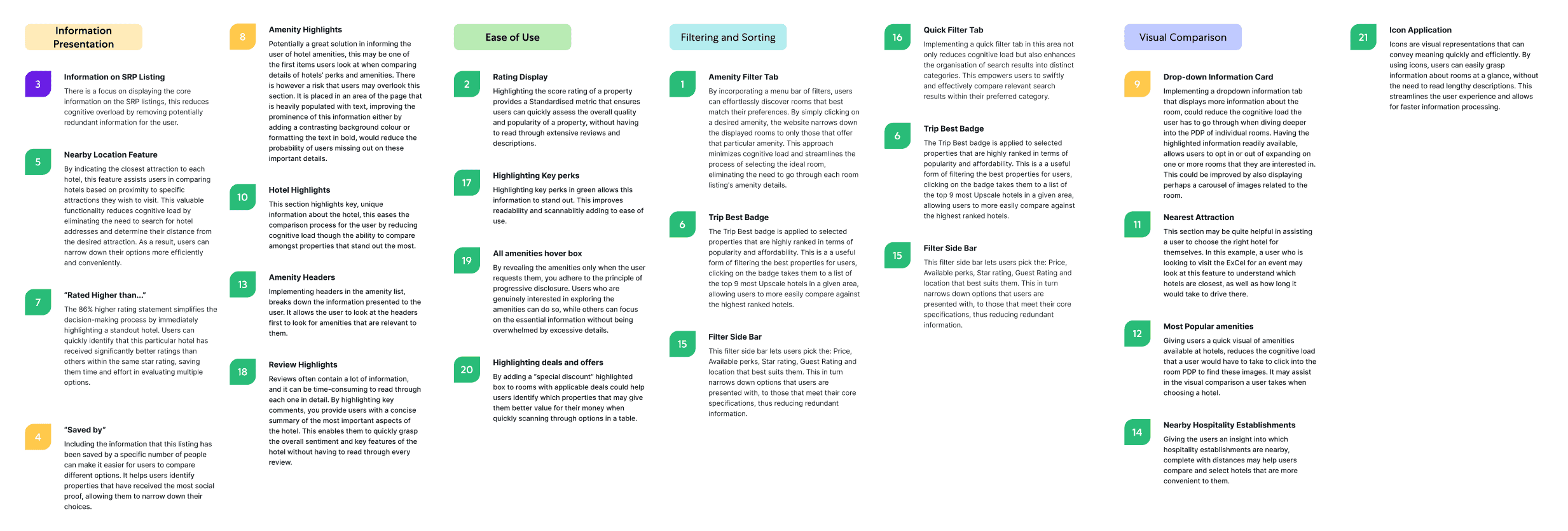
I structured the areas of focus and evaluation parameters to analyse our competitors' use of product comparison. The areas of focus are color-coded for better organization and to easily pinpoint how competitors utilize product comparison. Evaluation parameters will assist in determining the effectiveness of our competitors' product comparison strategies. This approach will enable me to identify successful practices to learn from and potential weaknesses to leverage.
I structured the areas of focus and evaluation parameters to analyse our competitors' use of product comparison. The areas of focus are color-coded for better organization and to easily pinpoint how competitors utilize product comparison. Evaluation parameters will assist in determining the effectiveness of our competitors' product comparison strategies. This approach will enable me to identify successful practices to learn from and potential weaknesses to leverage.
Room Compare Comparative Analysis Labelling
Room Compare Comparative Analysis Labelling
Relevant areas to do with product comparison are labelled with numbers, green is successful, yellow is opportunity for improvement. Under the areas of focus are expanded points describing how each of the methods improve comparison and how effective they are.
Relevant areas to do with product comparison are labelled with numbers, green is successful, yellow is opportunity for improvement. Under the areas of focus are expanded points describing how each of the methods improve comparison and how effective they are.
Team Review and Insights
Team Review and Insights
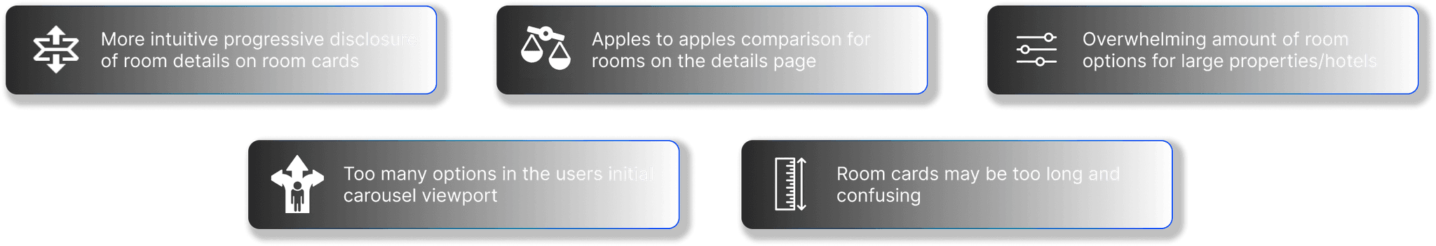
I presented these comparative analyses to the team and we all gathered 5 major insights on how our competitors are using product comparison and how we can capitalise on opportunities for improvement for the display of both the carousel and the wider display of room options.
I presented these comparative analyses to the team and we all gathered 5 major insights on how our competitors are using product comparison and how we can capitalise on opportunities for improvement for the display of both the carousel and the wider display of room options.
Users typically choose the cheapest option when selecting rooms, we believed this was due to the overwhelming nature of the rooms and rates display. However by doing this, many of our travellers often miss out on valuable amenities and offerings, potentially leading them to book a room that may not be ideal for them.
Our goal was to help determine what design and concepts helps travellers better understand and compare qualities of a room effectively. It was also to enhance discoverability and the personalisation of the display of rooms and rates on the product details page.
This project came with a few factors to consider. Firstly the short time frame, scalability of the design, multi-platform adaptation and aligning to Expedia Group’s design system.
Problem Statement
“Travellers are finding it difficult to browse and compare rooms and find the amount of room options overwhelming”
10 Week deadline. This work stream is geared towards fast paced design improvements
Scalability. Ensuring concepts can be applied to other Expedia Group LOBs such as flights and cruises.
Platform compatibility. Adapting the concept to Expedia Desktop, and mobile.
Aligning with EGDS (Expedia Group Design System)
Initial Solution
Mid Fidelity Wireframing - Carousel Design
Mid Fidelity Wireframing - Carousel Design
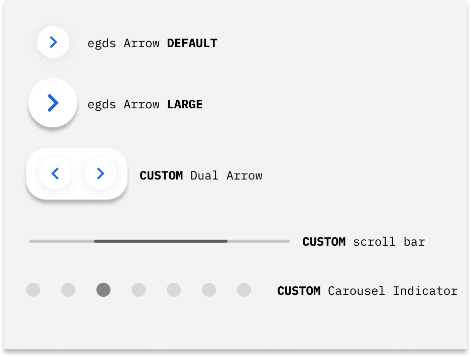
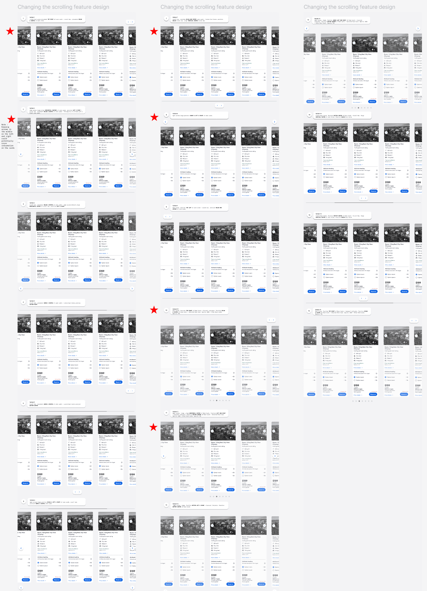
Starting off my ideation I created some mid fidelity wireframes on figma from the inspirations i gained from the comparative analysis i did on competitor carousels. I implemented a variet of different components, some were already available in the design system, some i had to make custom. I wanted to create an improved design for the carousel that includes more obvious affordances to ensure higher engagement with cards beyons the frame cutoff.
Starting off my ideation I created some mid fidelity wireframes on Figma from the inspirations I gained from the comparative analysis I did on competitor carousels. I implemented a variant of different components, some were already available in the design system, some I had to make custom. I wanted to create an improved design for the carousel that includes more obvious affordances to ensure higher engagement with cards beyond the frame cut-off.
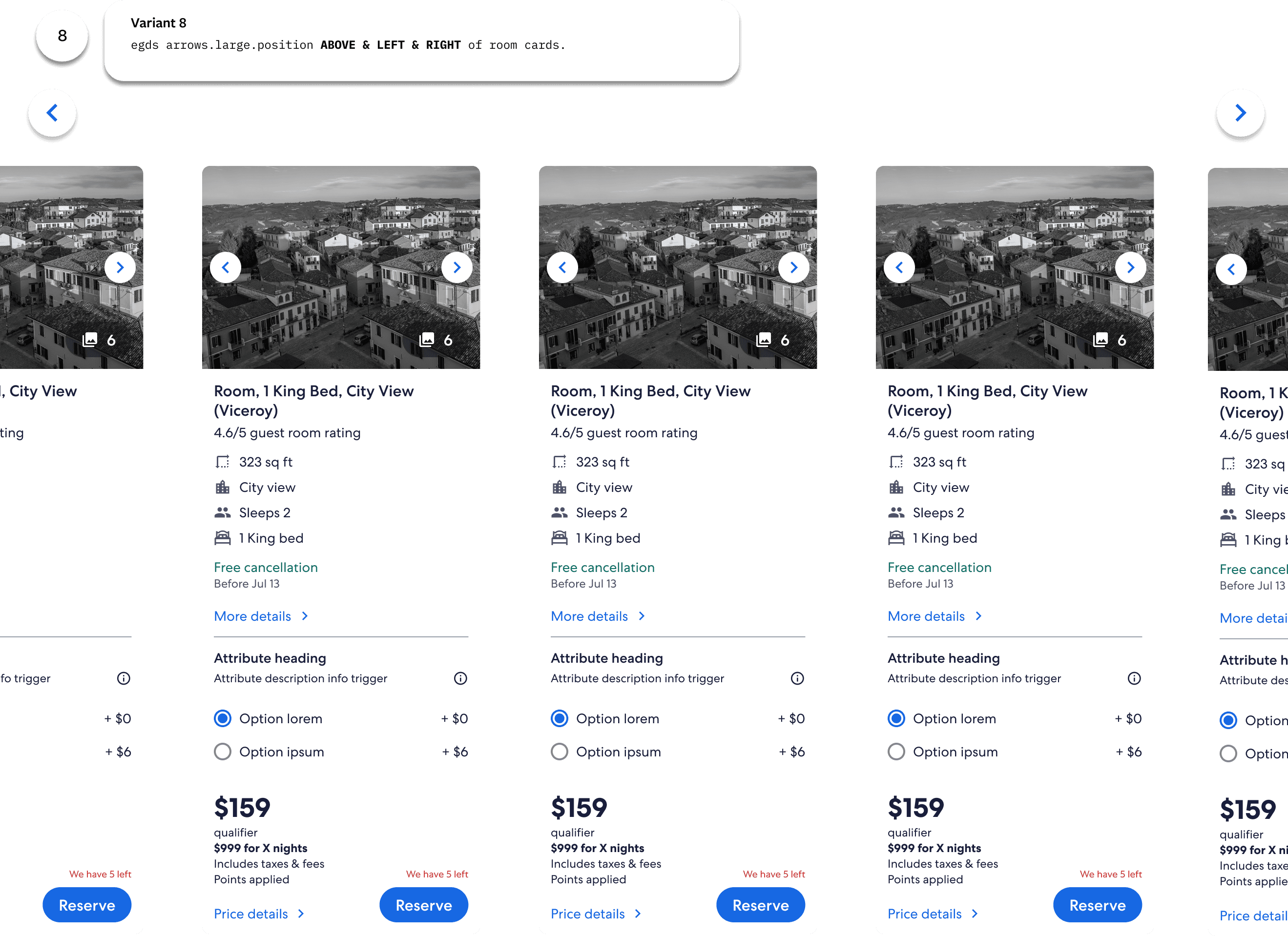
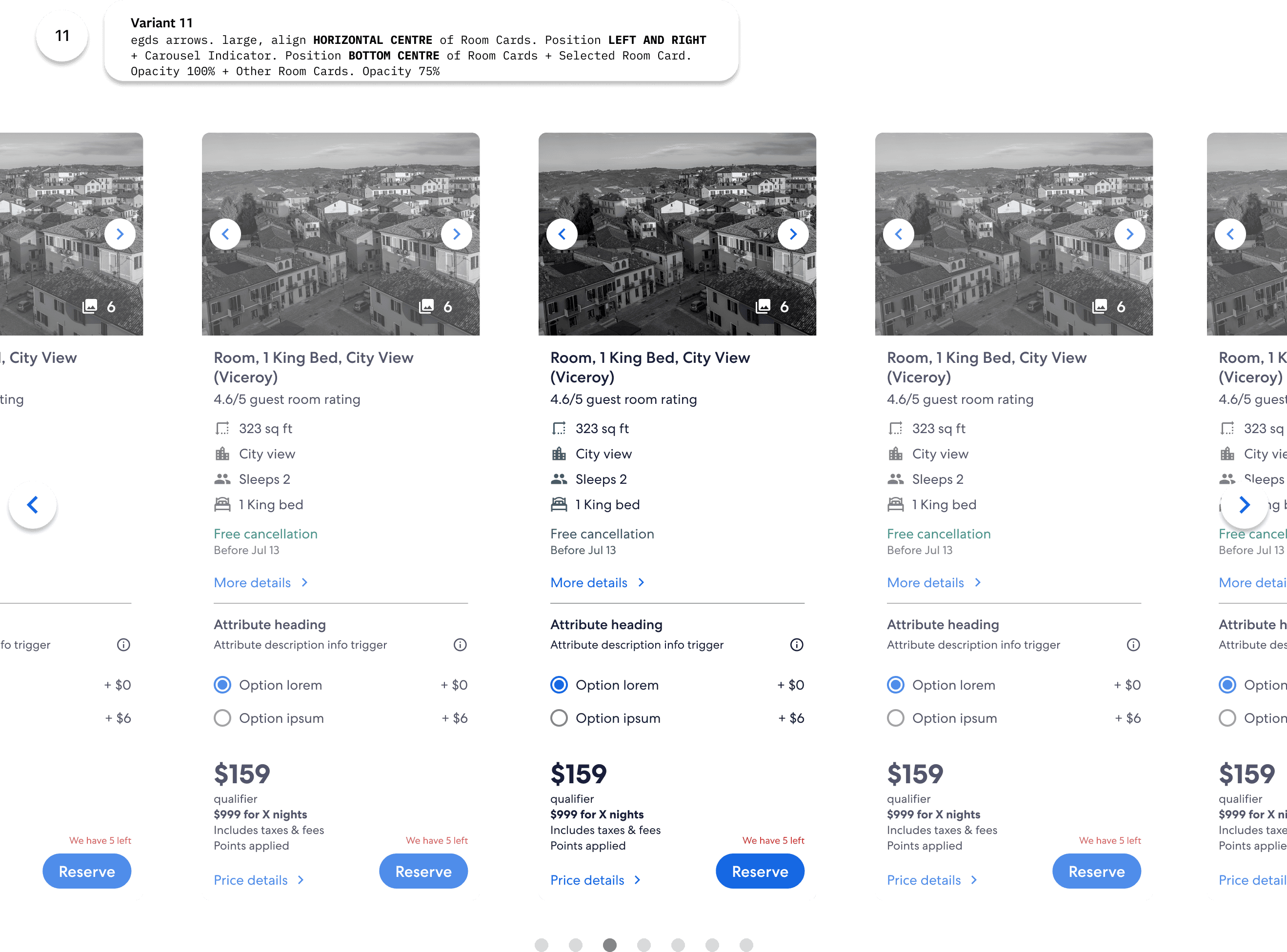
I created 16 variations of the desktop room carousel with different combinations of the components above. After feedback from the design and development team the ideas marked with a red star are the ones that were chosen for further development.
Given that this was a fast paced team and we were testing a completely new concept, I led a strategy with product management to implement smaller changes using the design components already in the design system, then if the Test and Learn (TNL) results are positive, incorporate larger changes, possibly involving custom components.
Leading a New Strategic Vision
Leading a New Strategic Vision
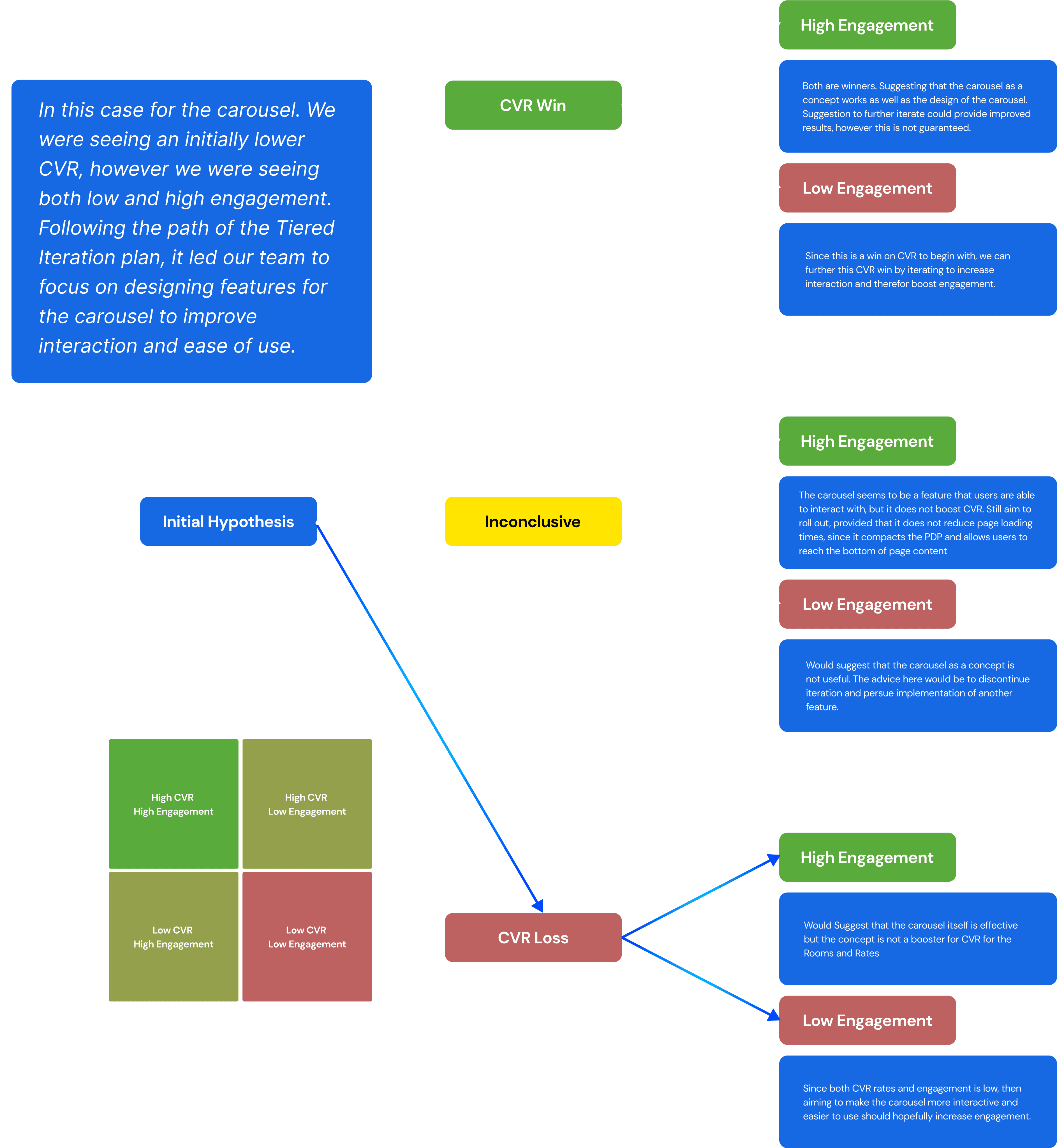
From our initial assumptions, a carousel as a concept can be effective, whilst the specific carousel tested may not be, due to users not being able to interact with it easily. Engagement is a measure of this “ease of interaction” with a high value being easy to interact with. Engagement should drive CVR but CVR can be driven without high engagement.
From our initial assumptions, a carousel as a concept can be effective, whilst the specific carousel tested may not be, due to users not being able to interact with it easily. Engagement is a measure of this “ease of interaction” with a high value being easy to interact with. Engagement should drive CVR but CVR can be driven without high engagement.
Leading the team towards improved comparison and personalisation within rooms and rates through the creation of a new strategic vision for new carousel feaures.
Leading the team towards improved comparison and personalisation within rooms and rates through the creation of a new strategic vision for new carousel feaures.
From the data from out initial TNL test. I initiated and led a strategic design vision for rooms and rates to push the brief and take full advantage of the potential a carousel has to offer. I worked with Product management and multiple stakeholders to create a plan of action to implement features within this carousel that improve, Comparison, Personalisation and discoverability of our travellers ideal stay.
From the data from out initial TNL test. I initiated and led a strategic design vision for rooms and rates to push the brief and take full advantage of the potential a carousel has to offer. I worked with Product management and multiple stakeholders to create a plan of action to implement features within this carousel that improve, Comparison, Personalisation and discoverability of our travellers ideal stay.
Chosen Carousel variants
Chosen Carousel variants
HIFI Final Desktop Room Carousel Design
HIFI Final Desktop Room Carousel Design
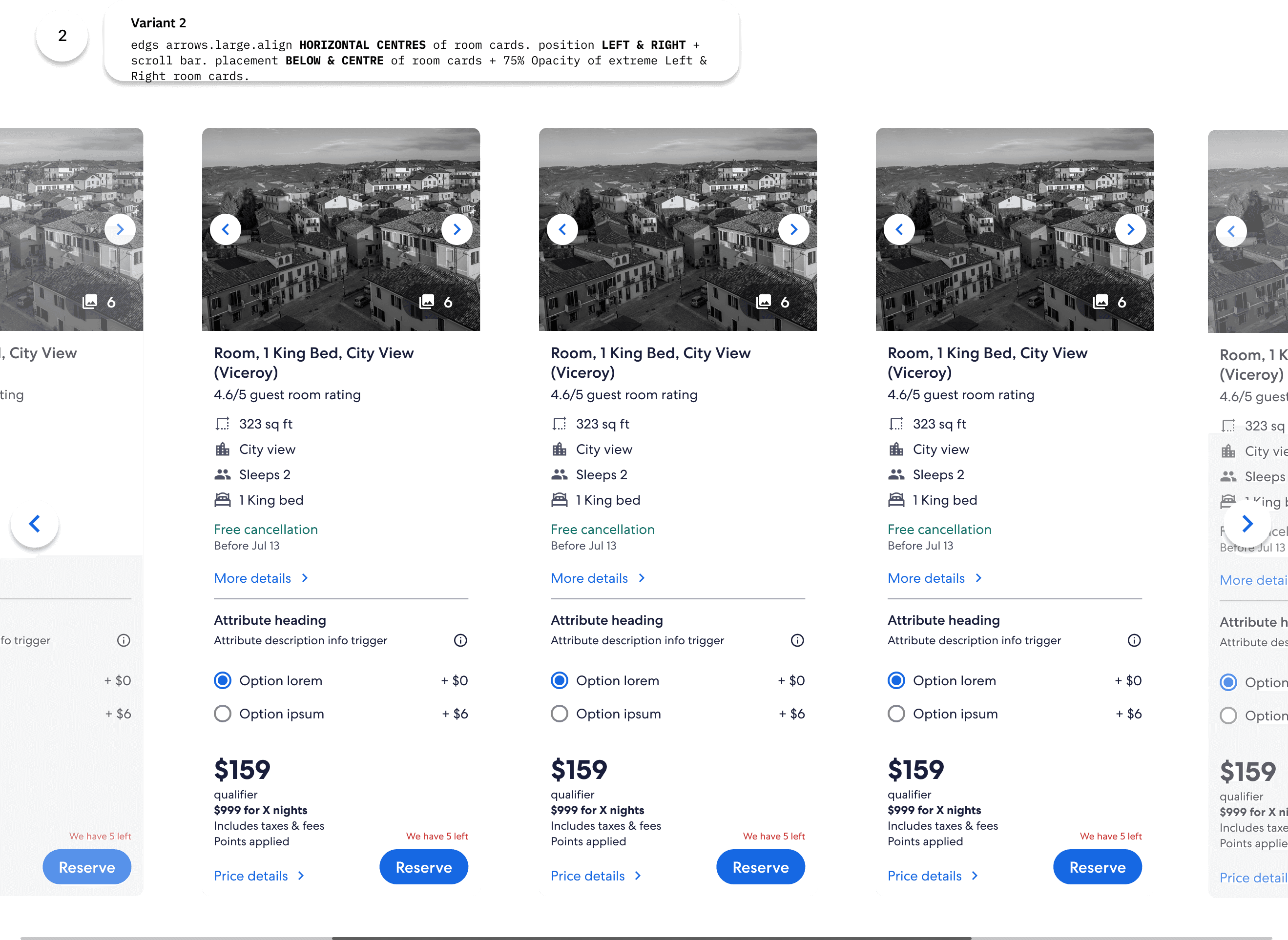
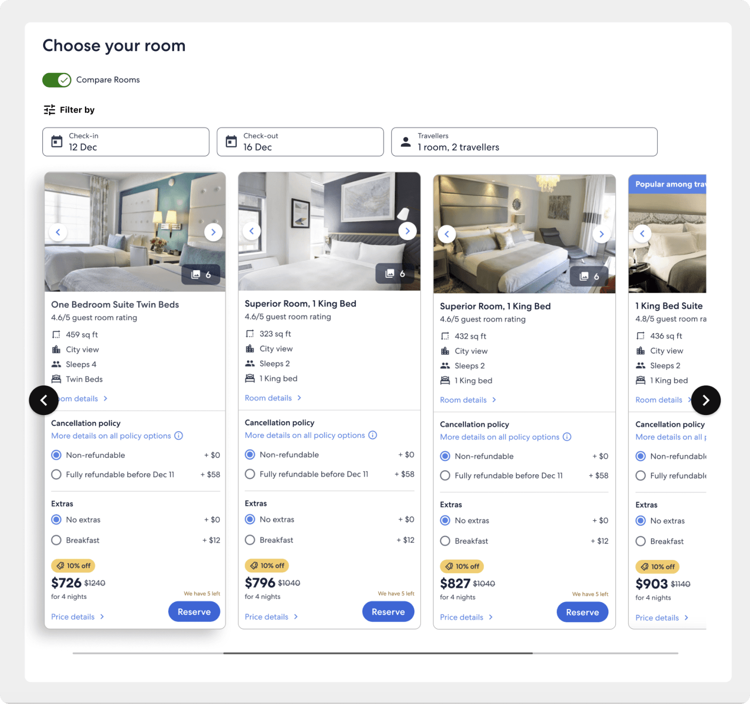
With another team sync session I collaborated with design, software engineers and product management to create a final design that both incorporates clear scrollable affordances on the carousel, as well as a concept that is optimised for build time. This final design used Expedia Design Group Design System (EGDS) dark theme arrows to contrast with the light background, as well as a simple scroll bar to ensure users are aware of their position within the carousel.
With another team sync session I collaborated with design, software engineers and product management to create a final design that both incorporates clear scrollable affordances on the carousel, as well as a concept that is optimised for build time. This final design used Expedia Design Group Design System (EGDS) dark theme arrows to contrast with the light background, as well as a simple scroll bar to ensure users are aware of their position within the carousel.
Pushing the brief further
Pushing the brief further
Expanding the Brief: Enhancing Carousel Design with Personalization and Comparison Features for Optimal User Experience
Expanding the Brief: Enhancing Carousel Design with Personalization and Comparison Features for Optimal User Experience
I wanted to further explore the potential for the desktop room carousel and the wider perspective of how Expedia displays rooms and rates to foster improved comparison, engagement. to help users find the room that is best for them, as well as enhancing conversion rates from the PDP to checkout. I decided to explore some larger ideas that could be implemented further down in the roadmap.
I wanted to further explore the potential for the desktop room carousel and the wider perspective of how Expedia displays rooms and rates to foster improved comparison, engagement. to help users find the room that is best for them, as well as enhancing conversion rates from the PDP to checkout. I decided to explore some larger ideas that could be implemented further down in the roadmap.
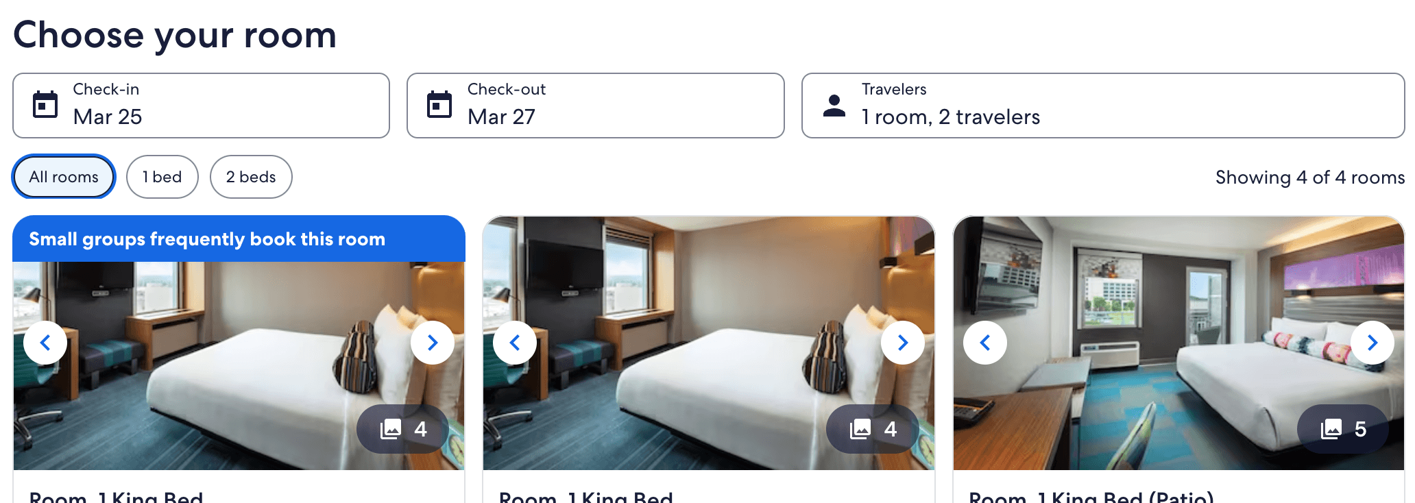
Using Shorter Cards - mWeb Variants
Using Shorter Cards - mWeb Variants
The average screen size of laptops spans 1366 x 768 Pixels. Furthermore the search field and bottom HUD also takes up space.
The current design of room cards are quite tall and may require users to scroll to see the room card in its entirety. This could be an opportunity to implement shorter room cards such as mWEB/ Micro Cards available via the EG Design system. To give users faster access to the entire card within their initial viewport.
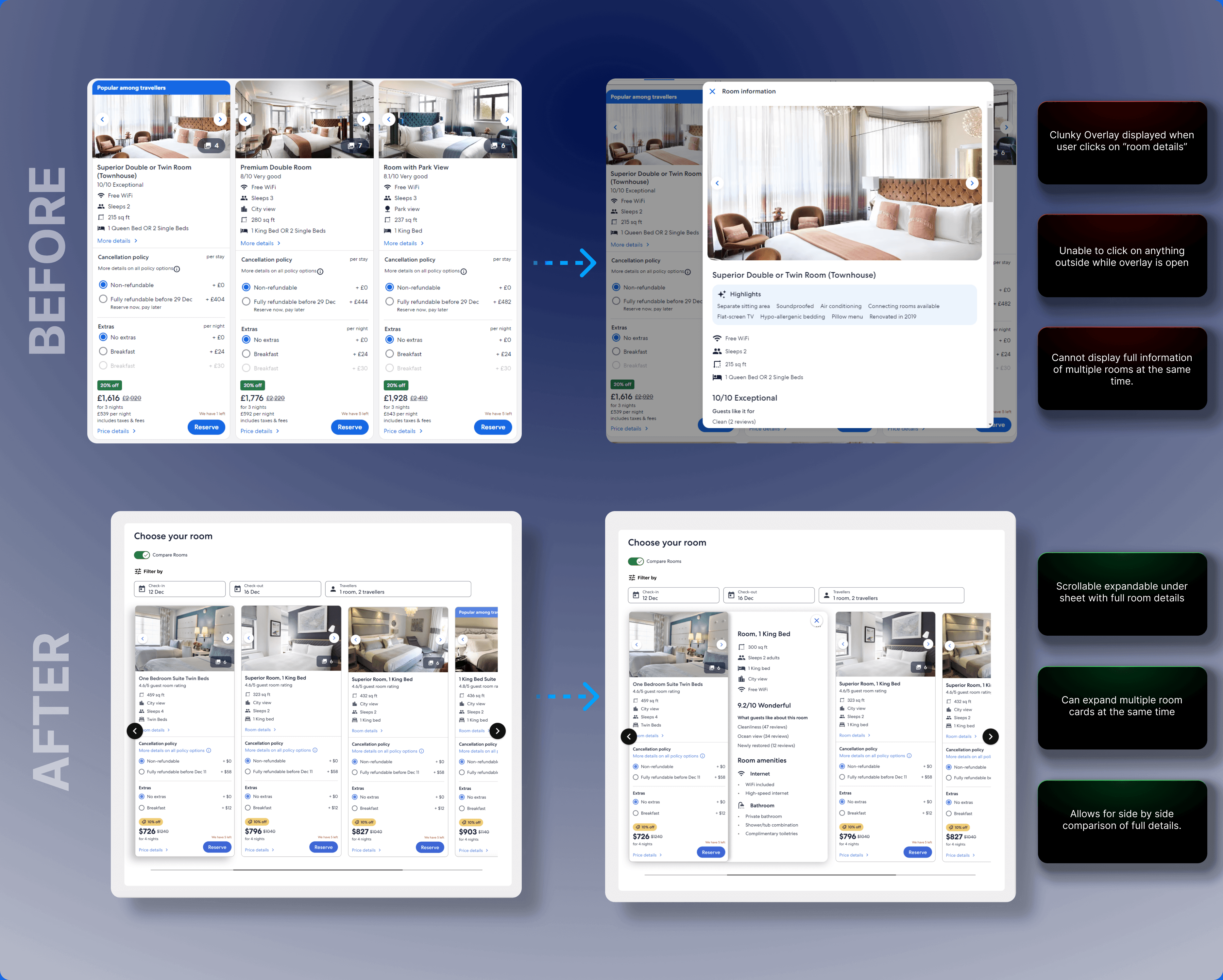
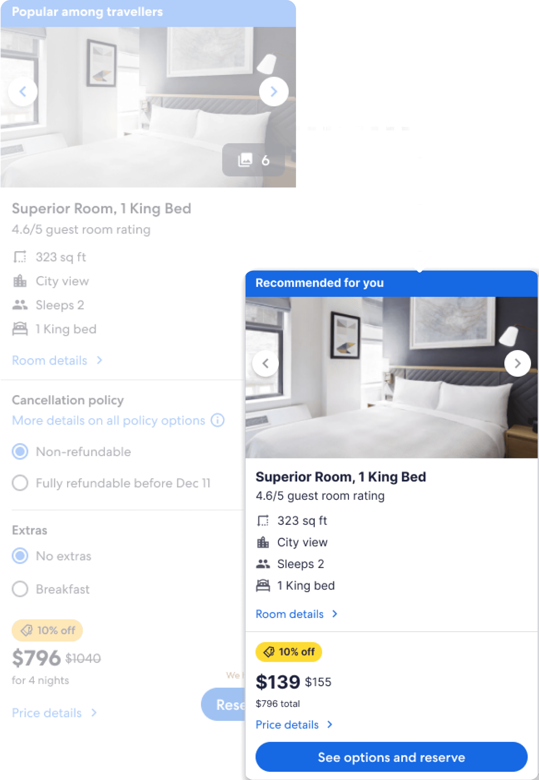
Room card Expando
Room card Expando
Allowing for more intuitive progressive disclosure expansion on room cards aims to help users compare multiple room cards along the carousel. Previously clicking on the “more details” button on a room card would bring up an overlay that would take up the entire screen. This is a problem as users can’t see or click on any other room cards doing so will close the overlay.
I designed a way that allows users to click on the “more details” CTA that opens an under sheet expansion from the side of the room card. This allows users open multiple cards and compare the details in full simultaneously.
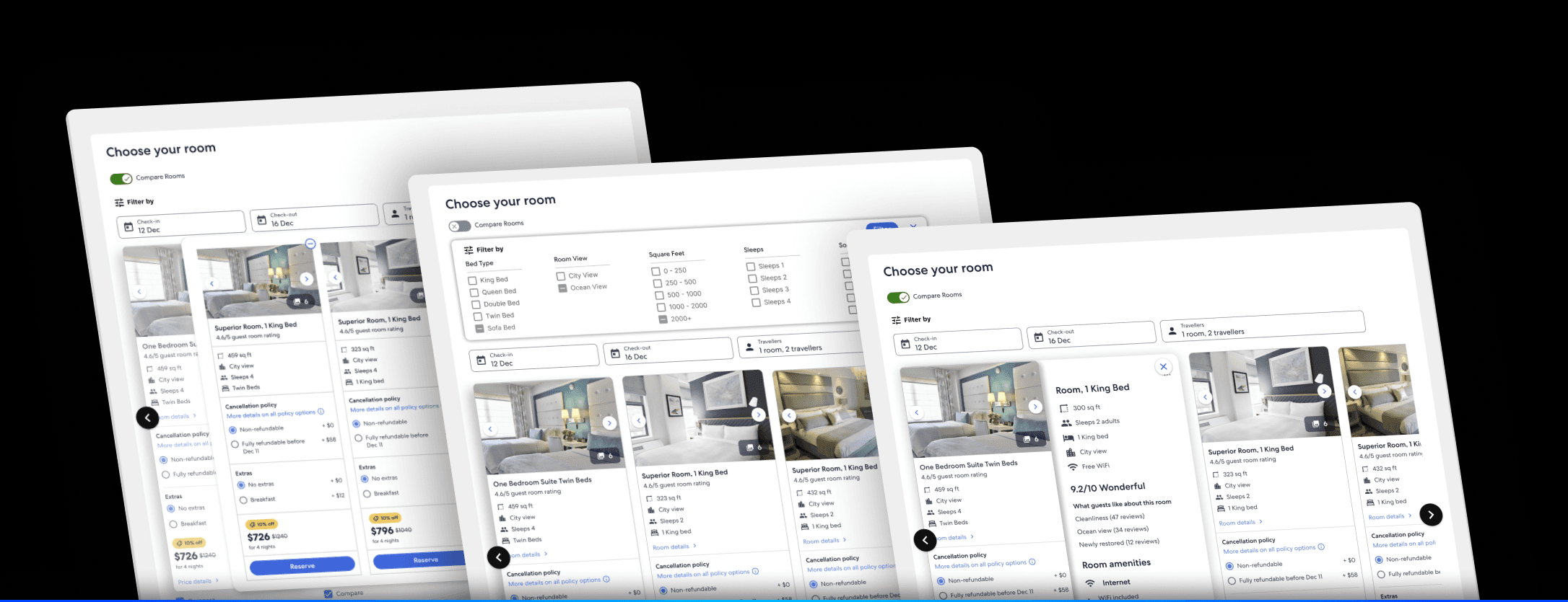
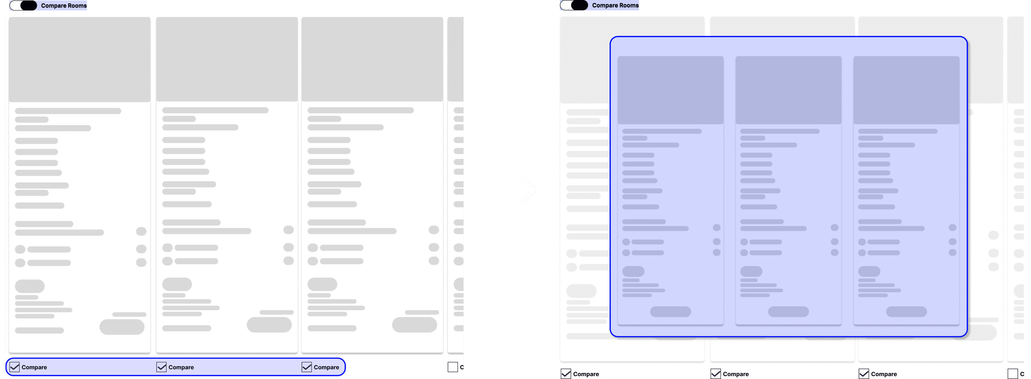
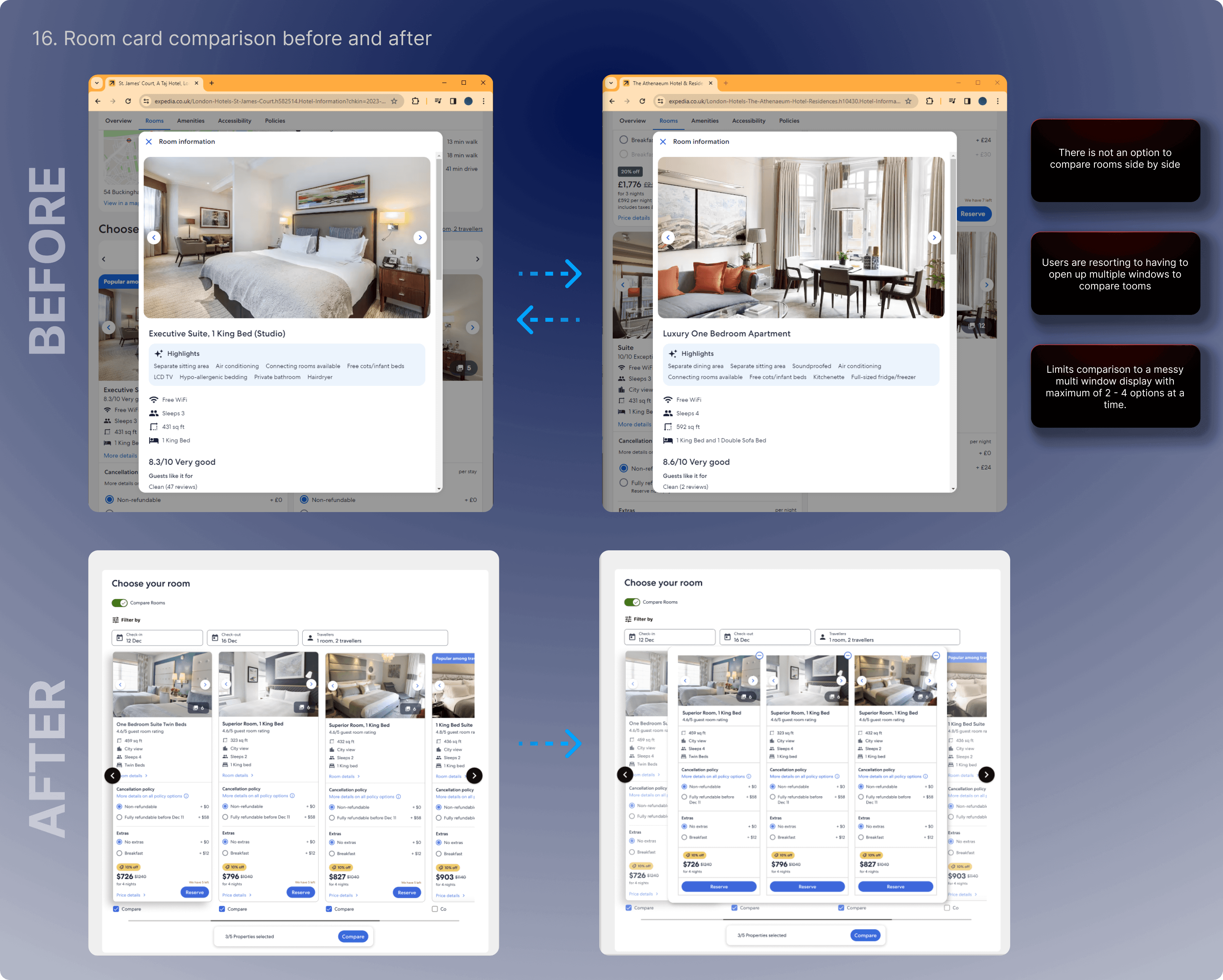
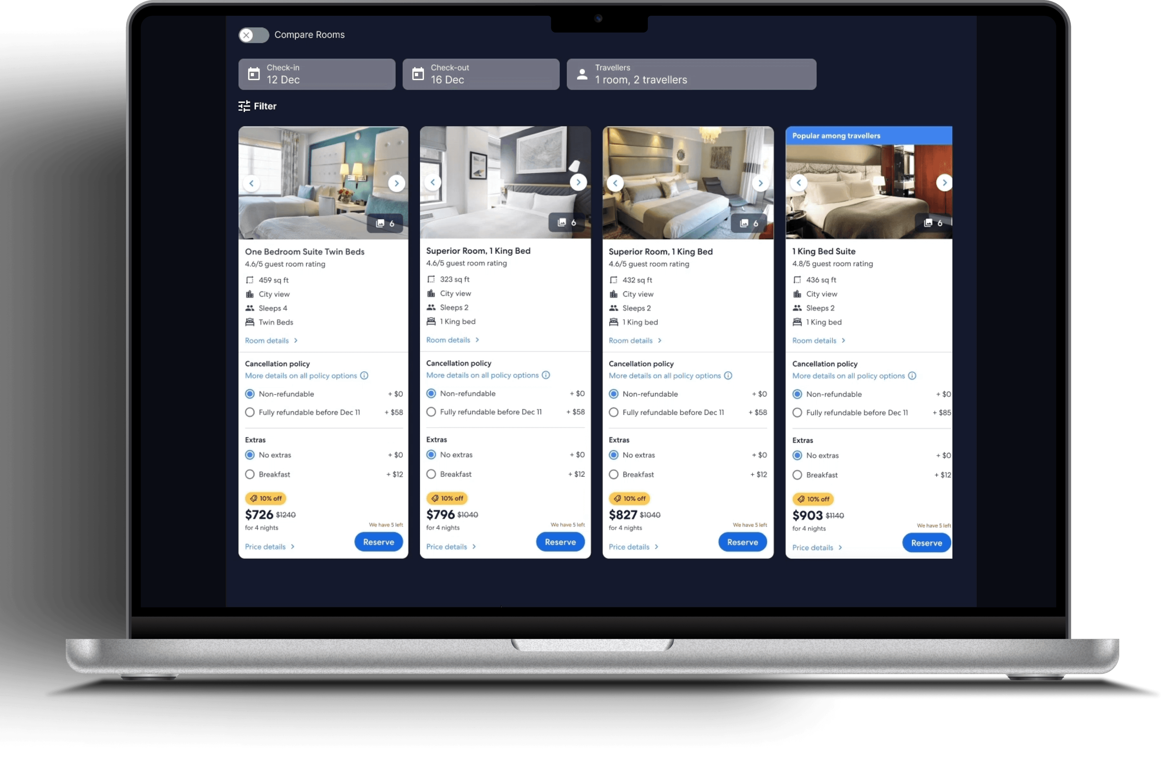
Apples-Apples Room Compare
Apples-Apples Room Compare
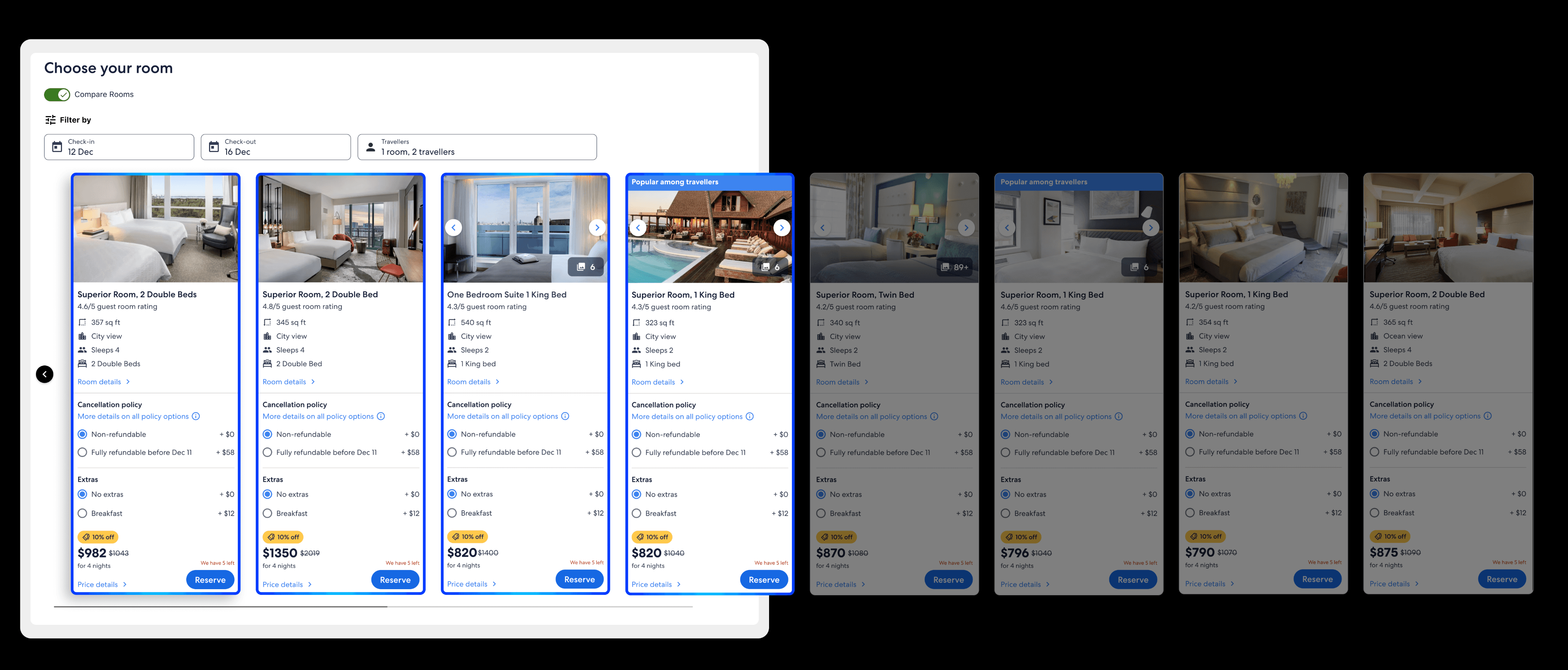
I aimed to create a feature that enables users to compare room cards seamlessly along the carousel without the need for repetitive scrolling to check details and recall their position. To enhance this functionality, I proposed an idea where users can choose specific cards of interest by utilising the compare checkboxes below. By selecting their preferred cards and activating the compare toggle at the top, users can view an overlay showcasing their selected options side by side. This design allows them to easily compare details in a lined-up manner, drawing inspiration from my analysis of how Apple presents products side by side.
I aimed to create a feature that enables users to compare room cards seamlessly along the carousel without the need for repetitive scrolling to check details and recall their position. To enhance this functionality, I proposed an idea where users can choose specific cards of interest by utilising the compare checkboxes below. By selecting their preferred cards and activating the compare toggle at the top, users can view an overlay showcasing their selected options side by side. This design allows them to easily compare details in a lined-up manner, drawing inspiration from my analysis of how Apple presents products side by side.
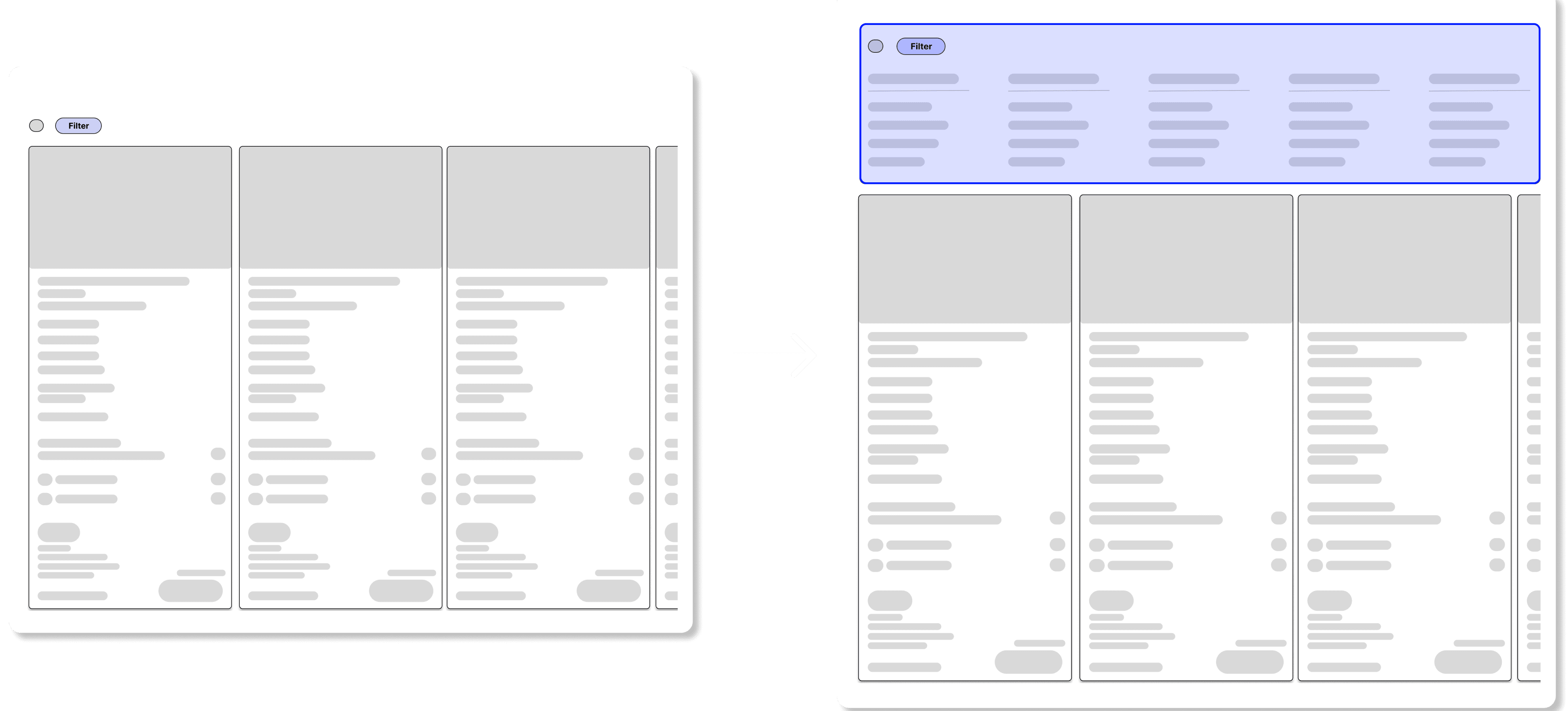
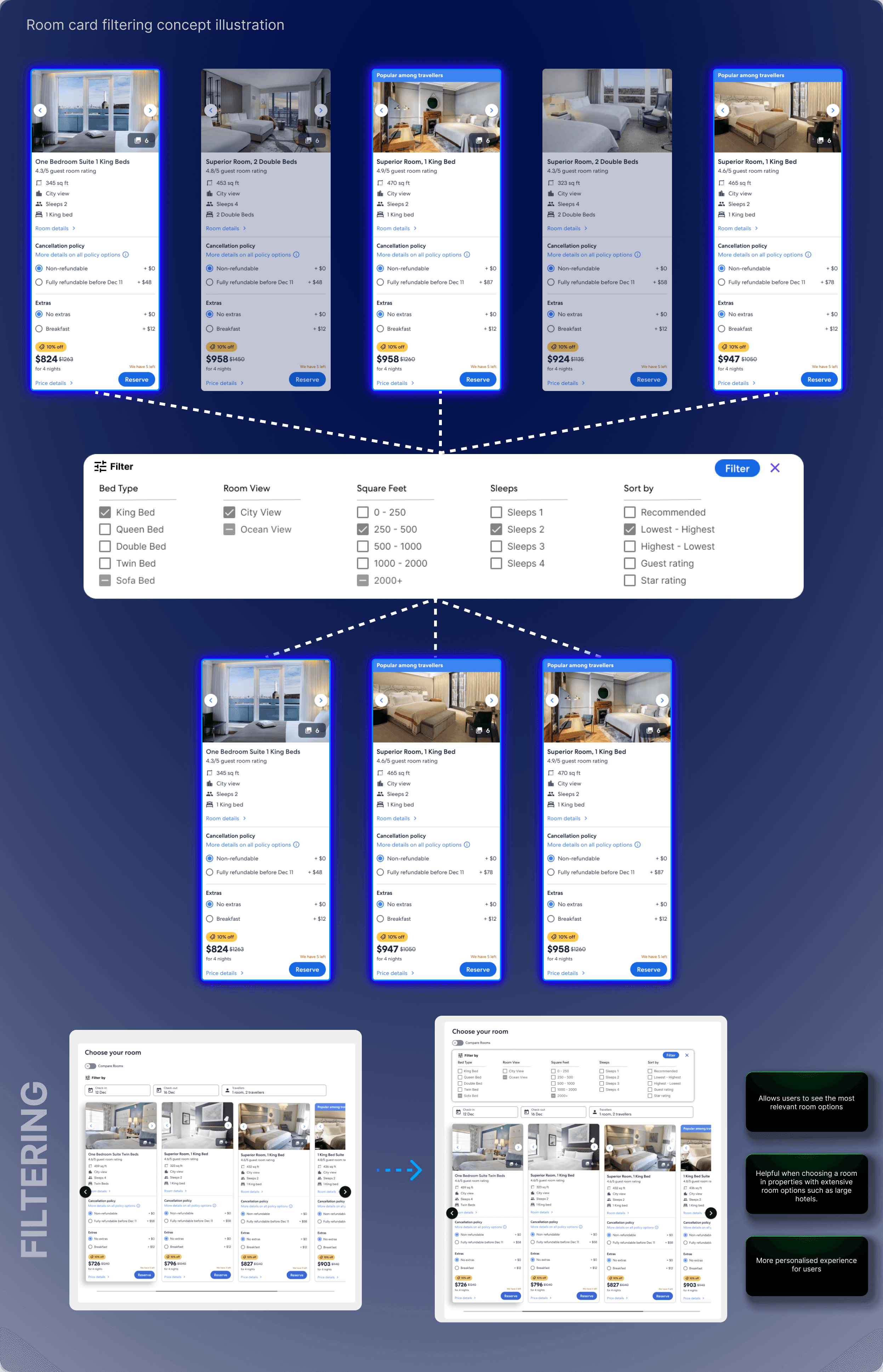
Room card filtering
Room card filtering
Hotels in sought after areas often offer many rooms sometimes exceeding over 40 room options, making it challenging for users to find the right fit. To streamline this process, I proposed adding a filter tab for rooms. When users click on the filter button, they can access various input fields to select their preferences. These categorised filters reduce cognitive load, helping users find the most relevant options quickly.
Hotels in sought after areas often offer many rooms sometimes exceeding over 40 room options, making it challenging for users to find the right fit. To streamline this process, I proposed adding a filter tab for rooms. When users click on the filter button, they can access various input fields to select their preferences. These categorised filters reduce cognitive load, helping users find the most relevant options quickly.
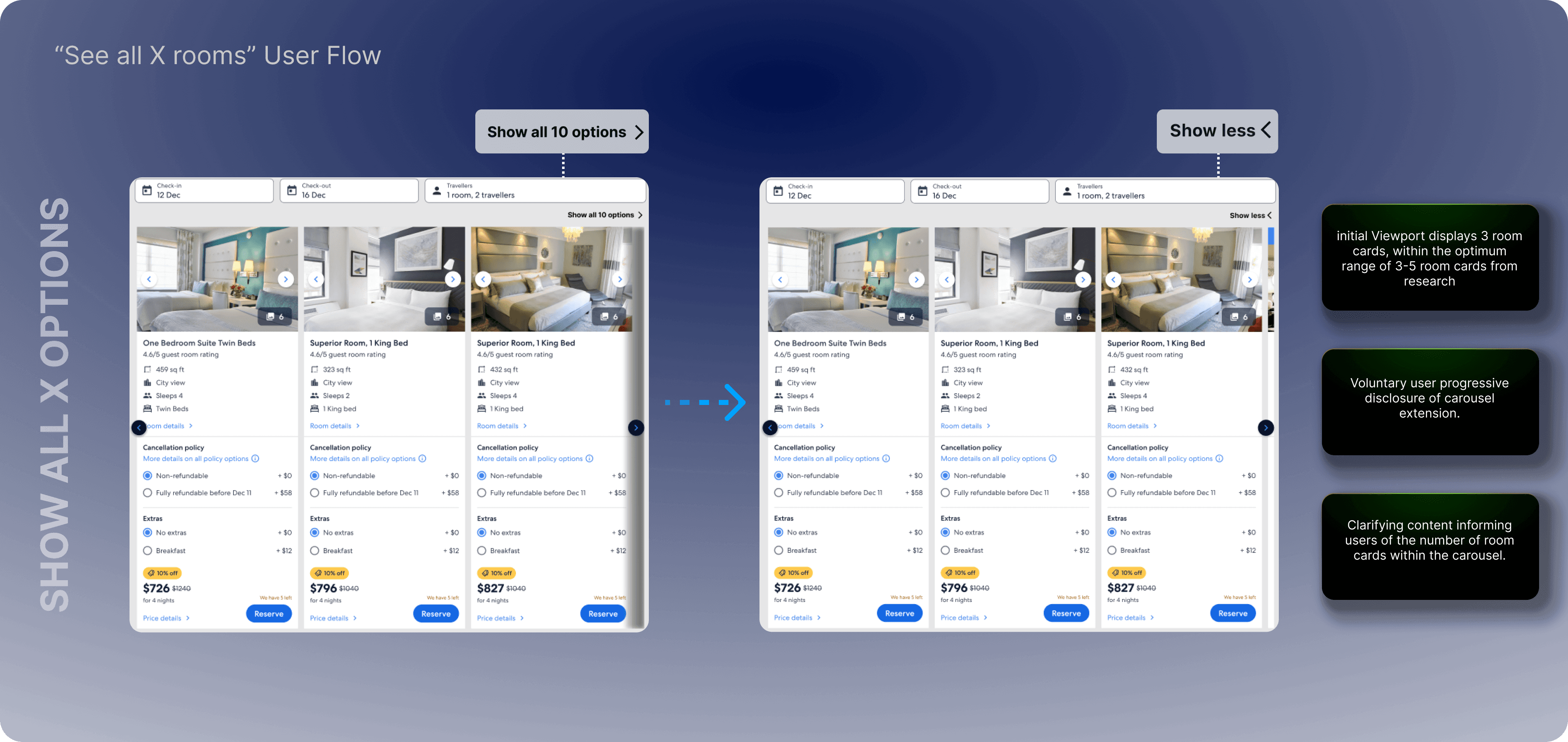
“See more Options”
“See more Options”
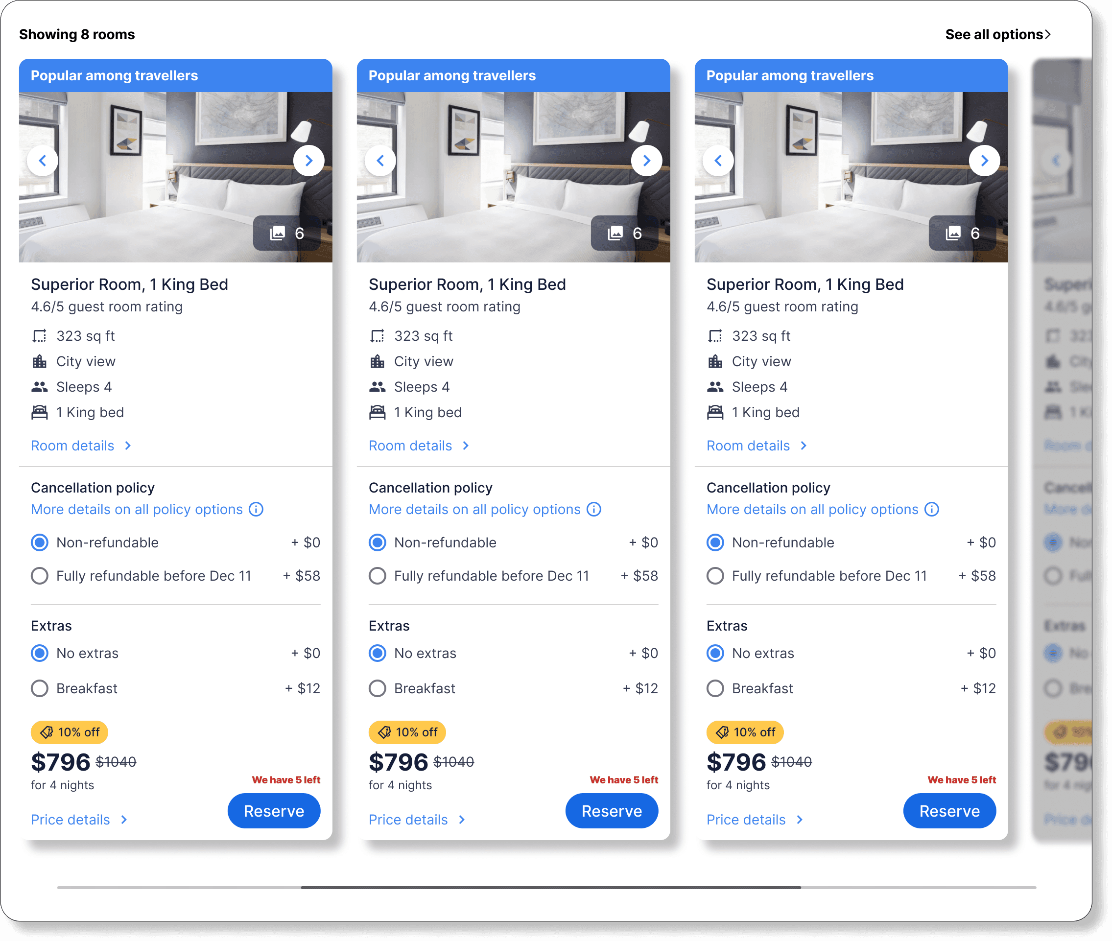
Our initial Test and Learn (TNL) data revealed that users tend to prefer viewing 3 - 6 room options. To enhance user experience, I suggested a design that showcases “showing x rooms” above the carousel, providing users with a clear indication of the number of choices available. By featuring Expedia’s recommended room options prominently at the forefront, and incorporating a mechanism to unlock the carousel for viewing additional options, the aim is to minimise cognitive overload. This approach also leverages Expedia’s personalized recommendations to drive higher user engagement.
Our initial Test and Learn (TNL) data revealed that users tend to prefer viewing 3 - 6 room options. To enhance user experience, I suggested a design that showcases “showing x rooms” above the carousel, providing users with a clear indication of the number of choices available. By featuring Expedia’s recommended room options prominently at the forefront, and incorporating a mechanism to unlock the carousel for viewing additional options, the aim is to minimise cognitive overload. This approach also leverages Expedia’s personalized recommendations to drive higher user engagement.
04.
Prototype
HIFI Wireframing
Interactive Prototypes
Team Evaluation
HIFI Wireframing and Prototypes
HIFI Wireframing and Prototypes
1
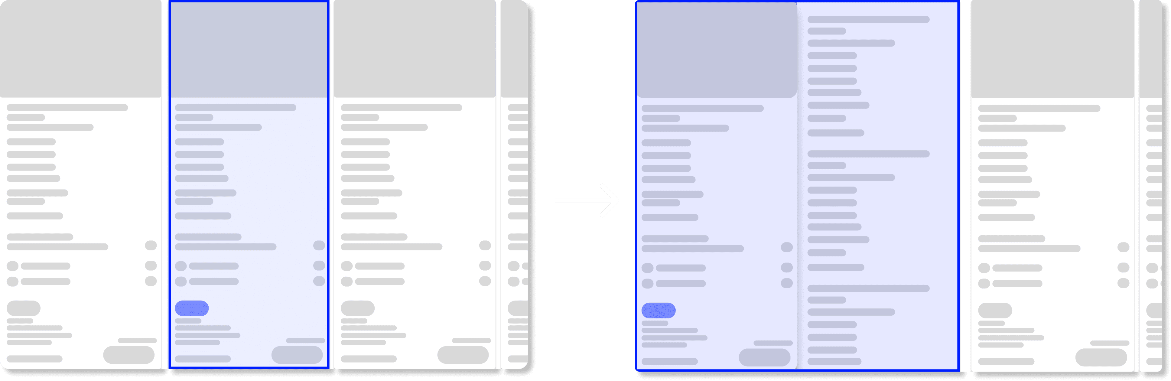
Room Card Expansion
Room Card Expansion

2
Room and Rates comparison tool
Room and Rates comparison tool
Allows users to compare room options side by side wherever they are in the carousel.
Can compare options in the same window for simplicity and ease of use.
Can compare up to 5 options at a time side by side.
Allows users to compare room options side by side wherever they are in the carousel.
Can compare options in the same window for simplicity and ease of use.
Can compare up to 5 options at a time side by side.
Allows users to compare room options side by side wherever they are in the carousel.
Can compare options in the same window for simplicity and ease of use.
Can compare up to 5 options at a time side by side.
17. Room card comparison prototype recording

1
Scroll through the carousel and find options that interest you.
2
Click on the compare toggle on top of the carousel.
3
Select the options using the compare checkboxes under the room cards.
4
Click on the compare button that opens a side by side comparison overlay.
Room and Rates Filtering Tool
Room and Rates Filtering Tool
3

“See all X Rooms”
“See all X Rooms”
4

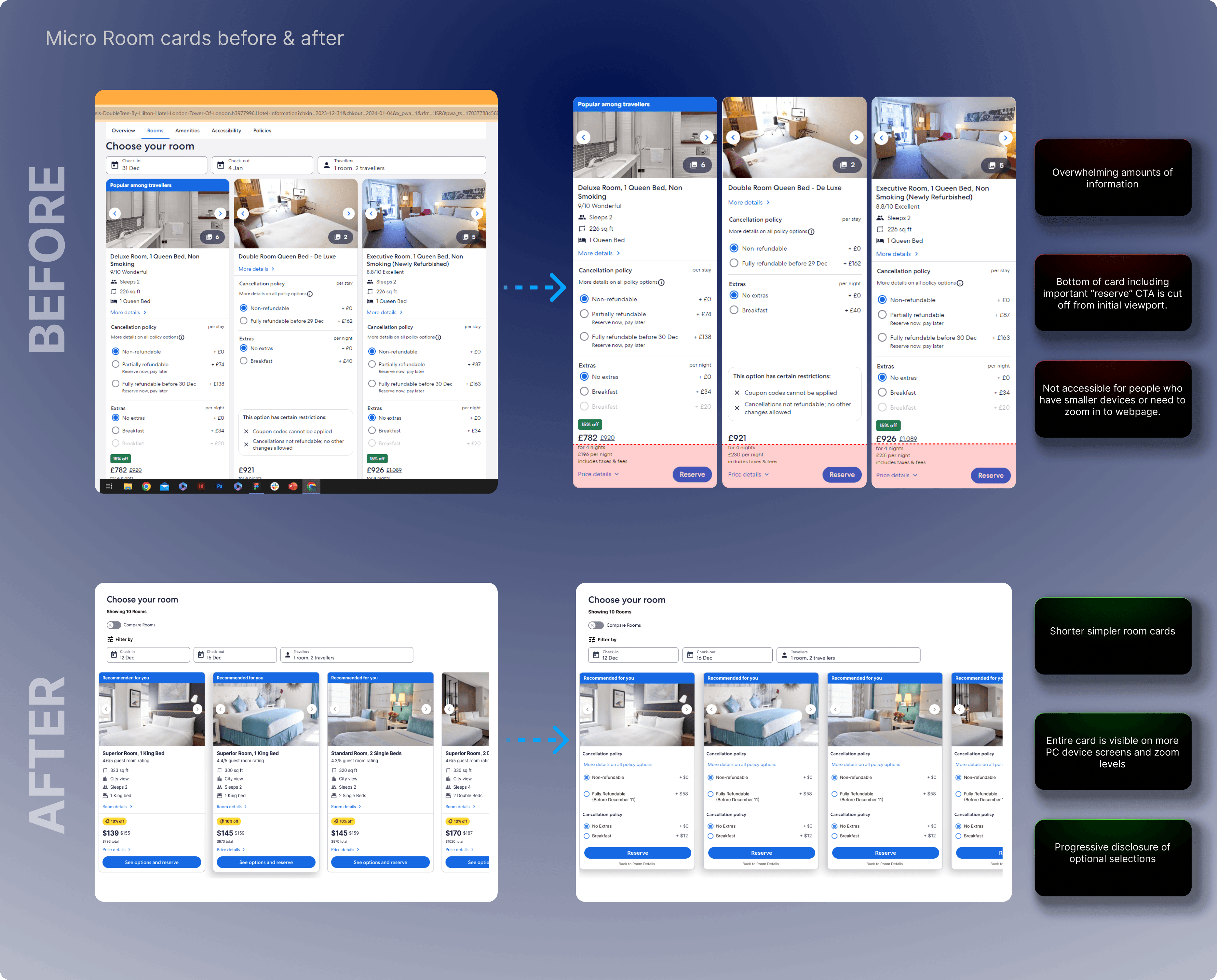
Micro Room Card Design
Micro Room Card Design
5
Concept generated 1.1% CVR = $1.1 Million
Concept generated 1.1% CVR = $1.1 Million…
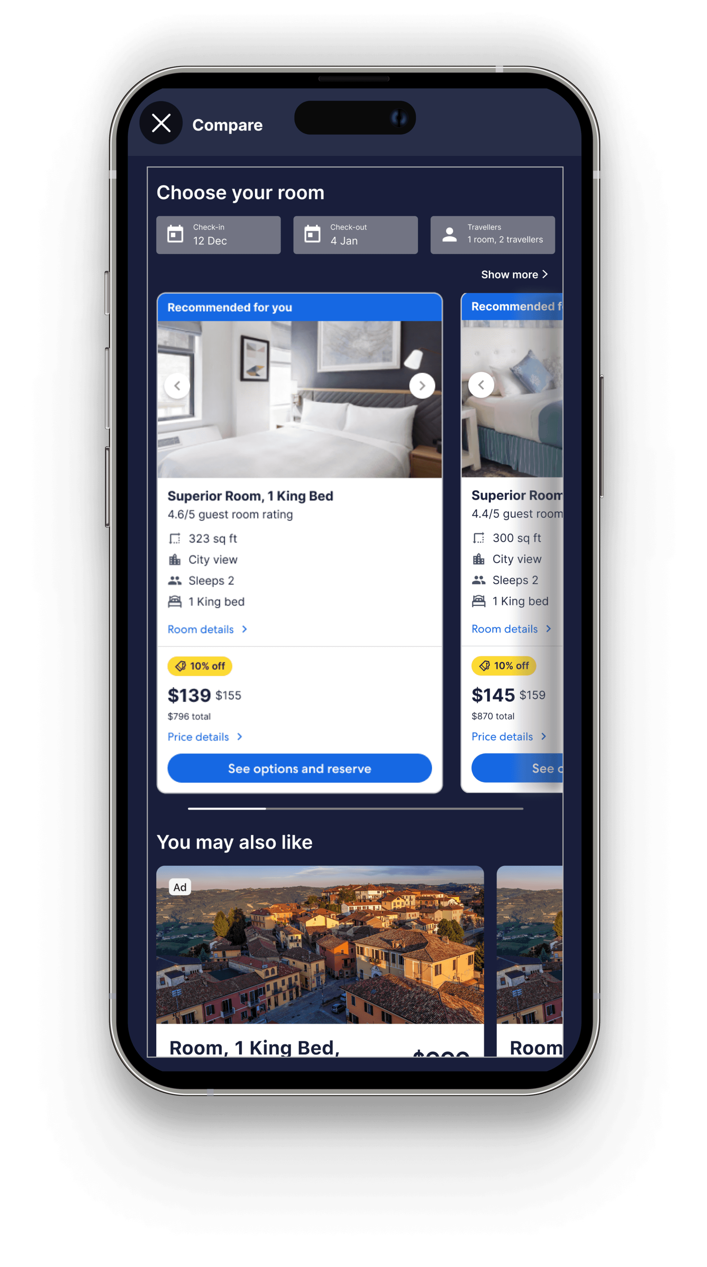
In order to provide better and easier comparison for users I thought of utilising progressive disclosure on the room cards displayed in the carousel. The original desktop room cards had two problems for users. Firstly, there was alot of information on the initial view of the room card, the main room details, selecting cancellation policies and extras. This may have contributed to the users feeling overwhelmed with options. Secondly, this room card design may not be accessible to all PC device screens, for example, the average laptop spans 13 - 15 inches. I noticed that the bottom of the card was being cut off from the initial viewport.
My solution incorporated two aspects. I thought of using a different variant of room card for the carousel. Expedia have a simpler, shorter room card variant on their mWeb platform. This aims to reduce the amount of information initially displayed to the user. In order to simplify, yet keep the same level of information. I also created a second face for each card including cancellation and extra options behind a CTA “See options and reserve”.
In order to provide better and easier comparison for users I thought of utilising progressive disclosure on the room cards displayed in the carousel. The original desktop room cards had two problems for users. Firstly, there was a lot of information on the initial view of the room card, the main room details, selecting cancellation policies and extras. This may have contributed to the users feeling overwhelmed with options. Secondly, this room card design may not be accessible to all PC device screens, for example, the average laptop spans 13 - 15 inches. I noticed that the bottom of the card was being cut off from the initial viewport.
My solution incorporated two aspects. I thought of using a different variant of room card for the carousel. Expedia have a simpler, shorter room card variant on their mWeb platform. This aims to reduce the amount of information initially displayed to the user. In order to simplify, yet keep the same level of information. I also created a second face for each card including cancellation and extra options behind a CTA “See options and reserve”.

Final Team Evaluation
Final Team Evaluation
At my last team sync, I shared these concepts with other UX Designers, Software Engineers, Product Managers, and Leadership to gather feedback. The goal of this session was to work together with the entire team to choose and refine these concepts for inclusion in the roadmap. The feedback highlighted a strong interest in advancing the filtering concept and adding the room carousel feature to Expedia’s app platform.
At my last team sync, I shared these concepts with other UX Designers, Software Engineers, Product Managers, and Leadership to gather feedback. The goal of this session was to work together with the entire team to choose and refine these concepts for inclusion in the roadmap. The feedback highlighted a strong interest in advancing the filtering concept and adding the room carousel feature to Expedia’s app platform.
05.
Test
Platform Insights
Carousel App Launch
Filtering Desktop Launch
Now Live on Expedia
Now Live on Expedia
The feature I designed and developed for filtering rooms and rates based on user preferences is now live on Expedia's Desktop and mobile web platforms.
The feature I designed and developed for filtering rooms and rates based on user preferences is now live on Expedia's Desktop and mobile web platforms.
With some editing to the UI to make this design more minimalistic. The concept of filtering rooms and rates on the PDP from user preferences is now a shipped feature on the product details page on Expedias Desktop and mWeb platforms.
With some editing to the UI to make this design more minimalistic. The concept of filtering rooms and rates on the PDP from user preferences is now a shipped feature on the product details page on Expedias Desktop and mWeb platforms.
Net Purchaser CVR = -0.87%
DESKTOP
APP
Net Purchaser CVR = +1.1%
Mobile screens have limited space, carousels allowed us to showcase multiple pieces of content within a more compact area. This is beneficial to Expedia’s App. The product details page hosts lots of information. Using a carousel greatly reduced the amount of space taken up compared to the previous stacked format of room cards.
SPACE OPTIMISATION
Carousels are better suited to mobile devices via apps or mWeb platforms because users can more easily swipe using their fingers oppose to using a mouse and dragging or scrolling in an unconventional horizontal direction.
TOUCH INTERACTIONS
We saw increased visibility and engagement on the first few cards in the carousel format compared to the stacked layout. This learning provided an opportunity to give users a more personalised experience, through more personalised features such as placing “Recommended” Rooms and Rates at the beginning or the carousel.
PRIME PLACEMENT ADVANTAGE
Key Learning - Launch on App
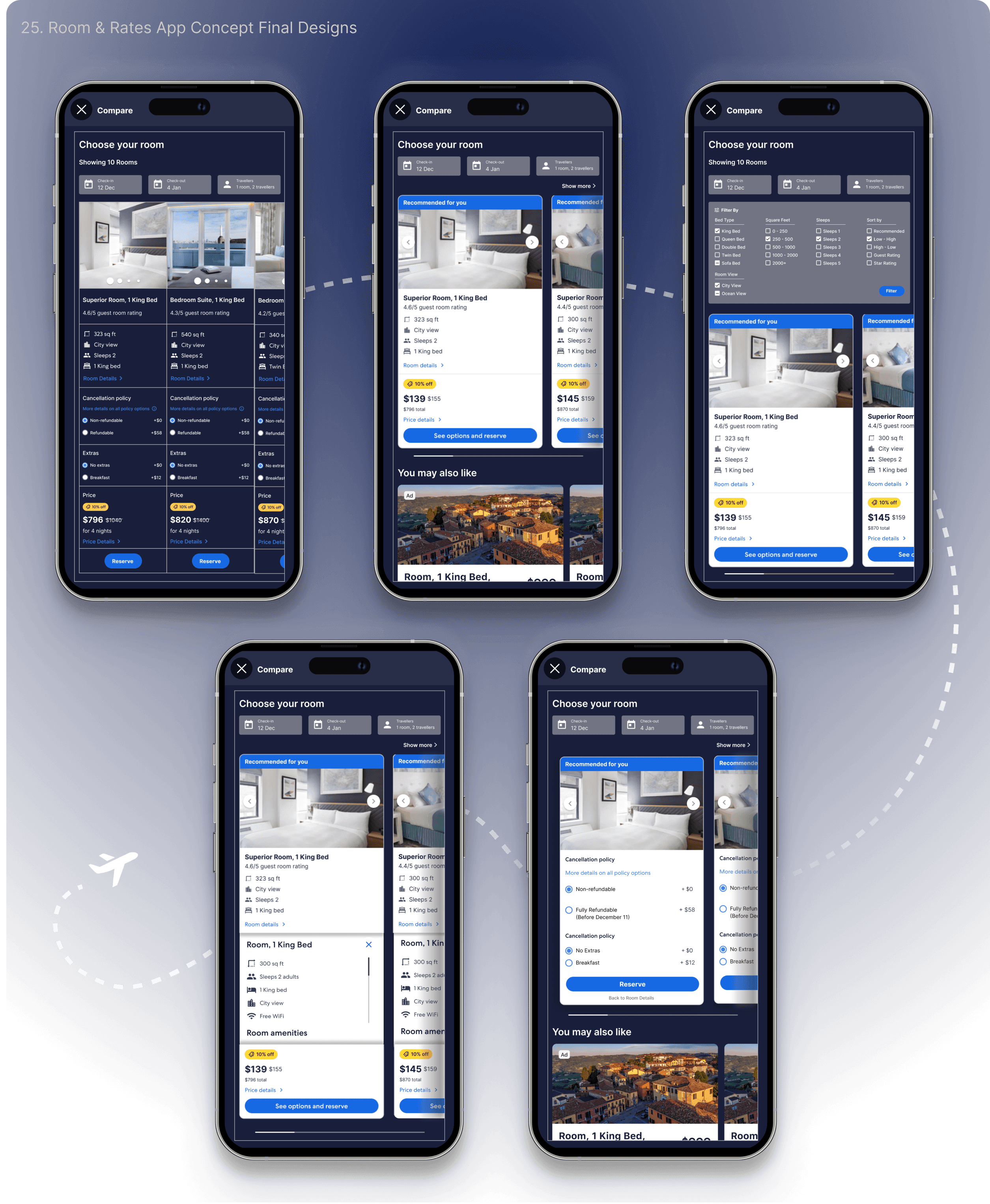
Micro room cards on app led to a $1.1 million boost in revenue
Micro room cards on app led to a $1.1 million boost in revenue
Conclusion
Conclusion
Overall this project was a success! With the carousel generating $1.1 Million in revenue and filtering now successfully shipped to Expedia.com
Overall this project was a success! With the carousel generating $1.1 Million in revenue and filtering now successfully shipped to Expedia.com
Here are some key takeaways from my project and my overall internship at Expedia
Here are some key takeaways from my project and my overall internship at Expedia

Setbacks are learning opportunities
Unexpected results in initial user testing are not setbacks but stepping stones to understand how users respond to our designs, allowing us to iterate for success in the future.

Don’t be afraid to push the brief
Pushing the boundaries of the brief is something that aimed to do during this internship and I believe this gave me more learnings of what is possible then I could of ever imagined.


The smallest changes can make the biggest differences
My time in a global company with high volumes of traffic showed me the power of seizing every opportunity and making strategic choices in design and implementation for success.